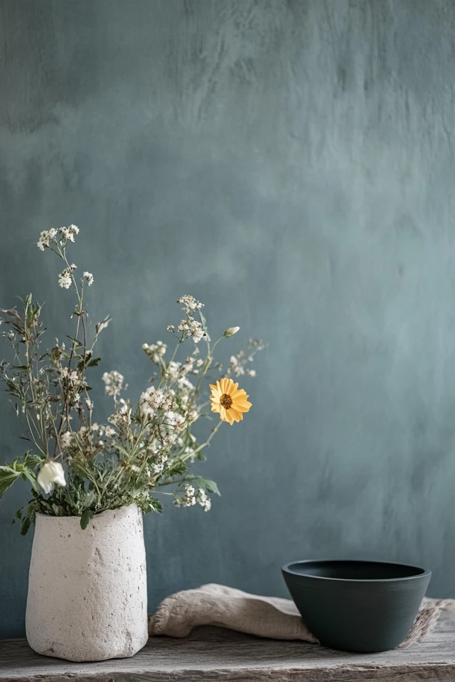
Scandinavian interiors are renowned for their light, airy, and serene feel, largely achieved through their thoughtful use of color. Inspired by the natural landscapes and muted tones of Nordic countries, these color palettes create harmony and a timeless aesthetic. Whether you’re revamping an entire home or just one room, choosing the right color palette is essential for mastering Scandinavian design.
I remember the transformative power of switching to a Scandinavian-inspired color scheme in my own home. Replacing bold, contrasting tones with soft neutrals instantly made my space feel more cohesive and calming. It also allowed the natural light to flow better, making even the smallest corners seem spacious and inviting.
In this guide, I’ll walk you through the best color palettes for Scandinavian interiors, so you can bring the beauty of Nordic design into your space.
Why Color Matters in Scandinavian Design
Key Principles
- Light and Neutral Tones: Create a sense of spaciousness and brightness.
- Subtle Contrasts: Add depth without overwhelming the space.
- Nature-Inspired Hues: Reflect the Nordic connection to the outdoors.
- Cohesion: A consistent palette throughout the home enhances flow and simplicity.
1. Classic White and Gray
Why It Works
This timeless palette is the foundation of Scandinavian design. White and gray tones create a bright, clean, and modern look that amplifies natural light.
How to Use It
- Paint walls in crisp white or light gray for an open, airy feel.
- Choose furniture in shades of gray to add subtle contrast.
- Incorporate black accents, like picture frames or pendant lights, for definition.
Example:
A white living room with a light gray sofa, a jute rug, and black metal lighting fixtures embodies Scandinavian minimalism.
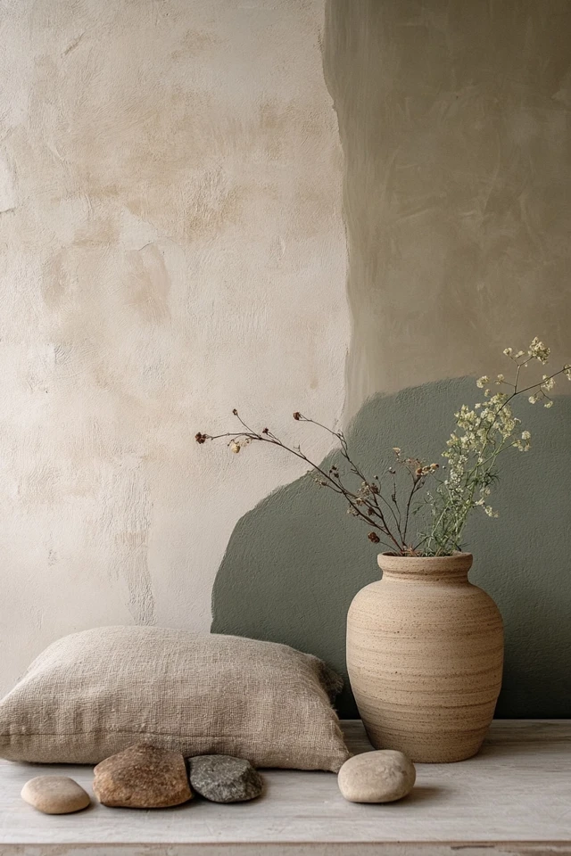
2. Earthy Beiges and Taupes
Why It Works
Beige and taupe tones add warmth and softness to Scandinavian interiors, making them feel cozier without straying from the minimalist aesthetic.
How to Use It
- Use beige for walls, upholstery, or rugs to create a soothing base.
- Pair with wooden furniture in light oak or ash for natural harmony.
- Add linen or cotton textiles in taupe for a layered, textural look.
Styling Tip:
A beige sofa with taupe throw pillows and a wooden coffee table creates a welcoming, earthy vibe.
3. Soft Pastels
Why It Works
Soft pastel shades bring a touch of color to Scandinavian interiors while maintaining their serene and understated quality.
How to Use It
- Use pastel pinks, blues, or greens for accents like cushions, throws, or vases.
- Pair with white or gray walls to keep the palette light and cohesive.
- Limit pastel colors to one or two tones to avoid visual clutter.
Example:
A pale pink blanket draped over a gray armchair adds subtle color to a neutral Scandinavian living room.
Picture Gallery

4. Monochromatic Black and White
Why It Works
This bold yet minimalist palette provides a modern take on Scandinavian interiors, combining high contrast with clean lines.
How to Use It
- Paint walls white and incorporate black furniture or decor for contrast.
- Use black-and-white patterns, like stripes or grids, for cushions or rugs.
- Balance the stark contrast with natural materials like wood or greenery.
Styling Tip:
A white dining room with black chairs and a wooden table creates a striking yet balanced monochromatic look.
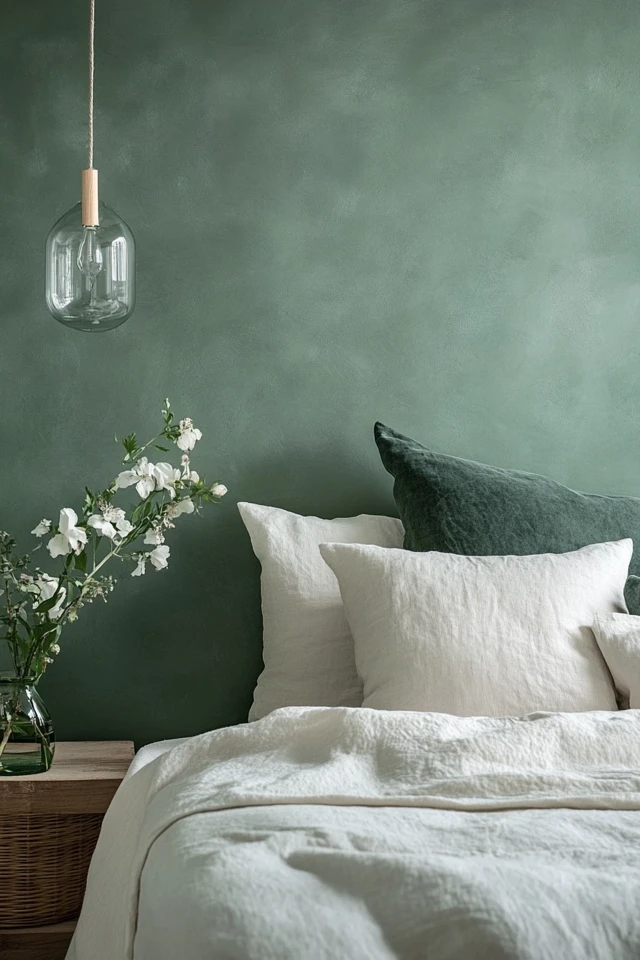
5. Muted Greens
Why It Works
Inspired by the Nordic forests, muted green tones bring a sense of tranquility and connection to nature.
How to Use It
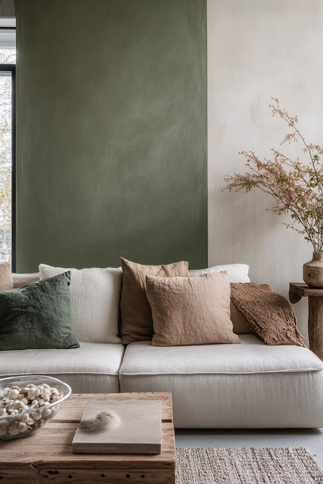
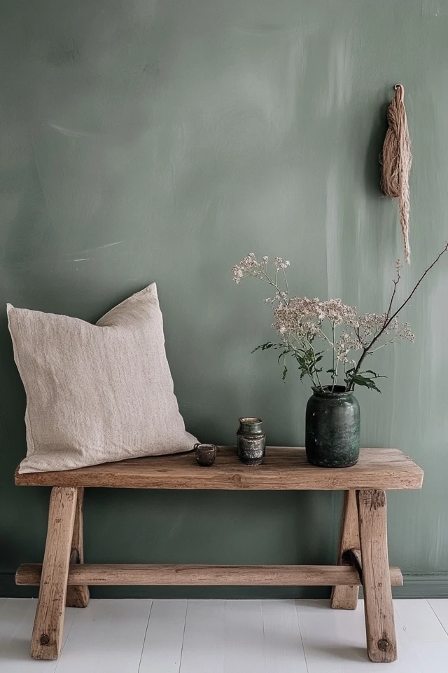
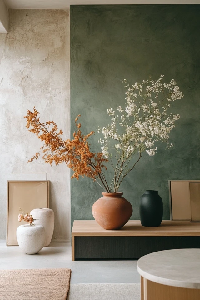
- Choose sage or olive green for accent walls, cabinetry, or decor.
- Pair with neutral tones like beige, gray, or white for balance.
- Use indoor plants to complement the green tones and add life to the space.
Example:
A sage green kitchen island paired with white walls and light wood flooring feels fresh and modern.
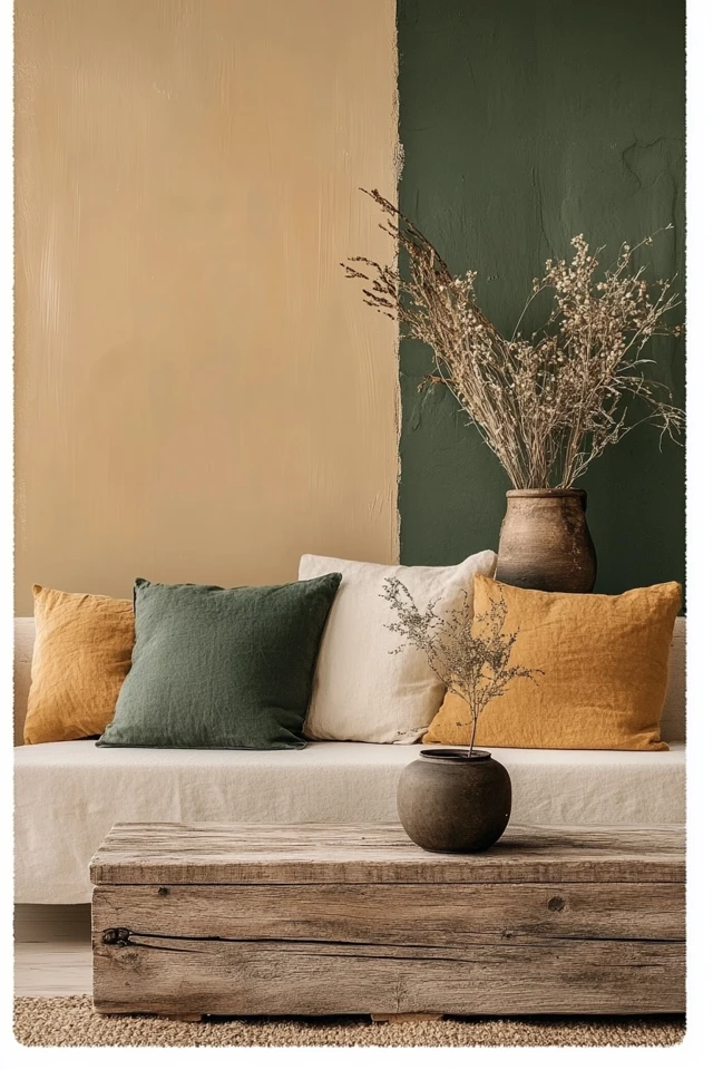
6. Warm Terracotta and Clay
Why It Works
Terracotta and clay tones introduce warmth and depth while remaining grounded in nature.
How to Use It
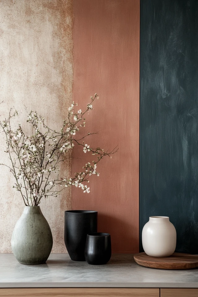
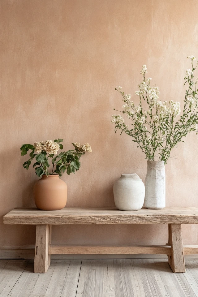
- Use terracotta for accent walls, throw pillows, or ceramics.
- Pair with neutral furniture and wooden accents to keep the look cohesive.
- Incorporate textiles like rugs or curtains in similar earthy tones.
Styling Tip:
A terracotta vase on a beige console table adds a subtle pop of warmth to a neutral room.
7. Light Blue and Gray
Why It Works
This palette evokes the calming hues of Nordic skies and seas, perfect for creating a serene, refreshing atmosphere.
How to Use It
- Use pale blue for accent walls or soft furnishings like bedding or curtains.
- Combine with light gray furniture and white walls for a cohesive look.
- Add silver or brushed nickel decor for a modern touch.
Example:
A light blue duvet cover paired with a gray upholstered bed creates a soothing Scandinavian bedroom.
8. Natural Wood Tones
Why It Works
Wood tones are essential in Scandinavian design, bringing warmth and texture to any palette.
How to Use It
- Use light wood for flooring, furniture, and decor to create an organic, cohesive look.
- Pair with white walls and neutral textiles for balance.
- Add darker wood accents, like walnut, for subtle contrast.
Styling Tip:
A light oak dining table with beige linen chairs perfectly embodies Nordic simplicity.
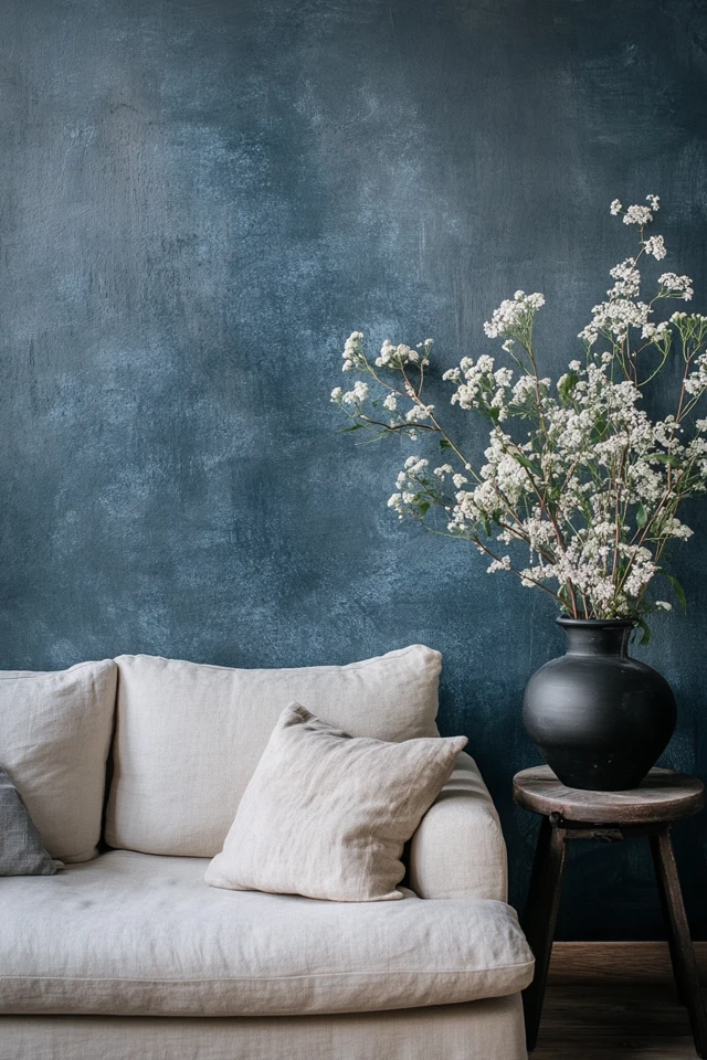
9. Dark Moody Accents
Why It Works
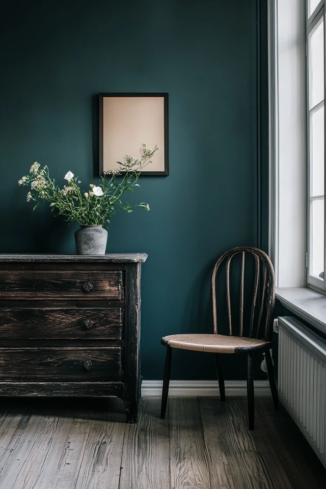
While Scandinavian design often leans toward light tones, incorporating dark moody hues like charcoal or navy can add depth and drama.
How to Use It
- Use dark colors for accent walls, furniture, or decor.
- Pair with lighter tones to maintain balance and avoid overwhelming the space.
- Use matte finishes for a sophisticated look.
Example:
A charcoal gray accent wall in a living room with white furniture creates a striking focal point.
How to Apply a Scandinavian Palette Across Your Home
- Keep Walls Neutral: White, beige, or light gray walls create the perfect backdrop for Scandinavian design.
- Layer Tones: Combine light and dark tones within the same palette for depth and visual interest.
- Add Natural Materials: Incorporate wood, wool, or linen to enhance warmth and texture.
- Use Color Sparingly: Add color through small accents like cushions, vases, or artwork to avoid overwhelming the space.
- Maintain Consistency: Use the same palette throughout your home for a cohesive look.
Conclusion
The perfect color palette is the foundation of Scandinavian interiors, creating the bright, calming, and harmonious feel that defines this design style. Whether you prefer classic neutrals, soft pastels, or earthy tones, each palette brings its unique charm to your space.
For me, embracing Scandinavian color palettes transformed my home into a sanctuary of light and calm. Every room felt more cohesive and inviting, allowing me to truly enjoy the beauty of simplicity.
So, choose a palette that speaks to you and let it guide your design choices. With the right colors, you can create a Scandinavian-inspired home that’s as timeless as it is tranquil.
FAQ
What are the key colors in Scandinavian design?
The key colors include white, beige, gray, muted greens, light blues, and natural wood tones, with occasional pops of black or pastel accents.
Can I use bold colors in a Scandinavian palette?
Yes, but use them sparingly. Opt for muted or earthy versions of bold colors, like terracotta or olive green, to maintain the calm aesthetic.
How do I make a Scandinavian space feel cozy?
Layer textures like wool throws, linen cushions, and natural wood tones to add warmth and comfort.
What’s the best way to add color to a Scandinavian room?
Introduce color through small accents like pillows, vases, or artwork, keeping the overall palette light and neutral.
Do Scandinavian palettes work in small spaces?
Absolutely! The light, neutral tones typical of Scandinavian palettes make small spaces feel larger and brighter.

