Introduction
Industrial design is known for its raw, minimalist aesthetic, often defined by neutral color palettes of grays, blacks, and earthy tones. However, incorporating bold colors can breathe new life into this style, adding personality and vibrancy without losing its industrial edge. The trick is finding the right balance—mixing bold and neutral colors in a way that feels intentional and cohesive.
I first realized the power of combining bold and neutral tones when I redecorated my living room. The exposed brick wall and metal accents set a strong industrial tone, but the space felt too stark and cold. I added a deep mustard-yellow armchair, a set of cobalt blue throw pillows, and a bold geometric rug. The transformation was remarkable—those pops of color gave the room warmth and energy while still maintaining its industrial character.
If you’re ready to elevate your industrial space with bold and neutral color combinations, this guide will show you how to do it effectively. From selecting the right shades to styling them harmoniously, we’ll explore techniques to make your space pop while staying true to its industrial roots.
Why Mixing Bold and Neutral Colors Works in Industrial Design
The neutral base of industrial design provides the perfect canvas for introducing bold colors. The muted tones of concrete, brick, metal, and wood create a grounding effect that allows brighter hues to stand out without overwhelming the space. Bold colors, when used sparingly, can enhance the room’s character and draw attention to key elements like furniture or decor.
By mixing bold and neutral colors, you achieve a balance that combines industrial design’s signature ruggedness with a sense of vibrancy and personality. This contrast prevents the space from feeling too monotone or cold, while still respecting the simplicity and functionality of the style.
Why These Key Elements Work So Well Together
Neutral Foundations
Neutral colors like gray, black, white, and beige form the backbone of industrial design. These tones are versatile, calming, and timeless, allowing bold colors to take center stage.
Bold Accents
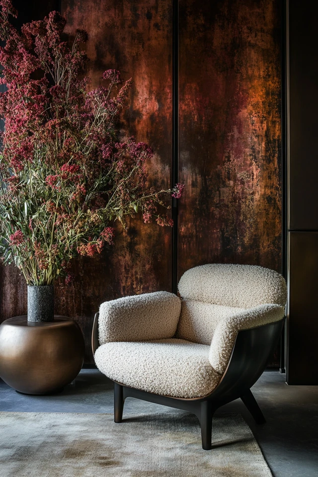
Pops of bold colors like mustard yellow, deep red, or emerald green add contrast and energy. When used strategically, these hues break up the monotony of neutrals and inject personality into the space.
Textures and Materials
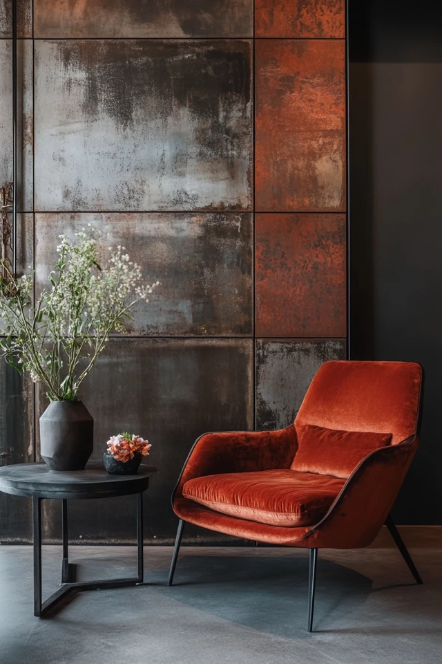
The texture of industrial materials—like exposed brick, concrete, and metal—softens the impact of bold colors, ensuring they don’t overpower the design. For example, a bright red chair set against a raw brick wall creates a striking yet harmonious look.
Evidence-Based Design
Research shows that combining neutral tones with bold accents promotes visual interest and emotional balance. Neutral tones create a sense of calm, while bold colors stimulate creativity and focus, making this combination ideal for modern living spaces.
How to Mix Bold and Neutral Colors in Industrial Design: Step-by-Step
Step 1: Establish a Neutral Base
- Start with industrial design’s classic palette—gray walls, exposed brick, or polished concrete floors.
- Use black or metal accents for fixtures, such as shelving, light fixtures, or railings.
Step 2: Select One or Two Bold Colors
- Choose bold shades that resonate with your personality and complement the neutral tones. Popular options include mustard yellow, deep blue, rust orange, or forest green.
- Limit your bold colors to one or two to maintain cohesion and avoid overwhelming the space.
Step 3: Incorporate Bold Furniture Pieces
- Use bold colors for statement furniture like a bright yellow sofa, a deep red armchair, or cobalt blue barstools.
- Position these pieces strategically to create focal points in the room.
Step 4: Add Colorful Textiles and Accessories
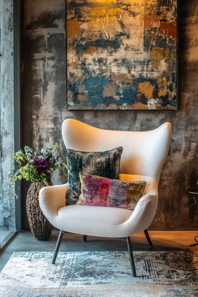
- Introduce bold colors through rugs, throw pillows, curtains, or wall art. These smaller items are easy to swap out if you want to update your look.
- Opt for geometric patterns or abstract designs to keep the industrial vibe intact.
Step 5: Balance with Neutral Layers
- Offset bold colors with neutral layers like white bedding, gray area rugs, or black metal frames.
- Use neutral tones in larger, more permanent features like walls and floors to anchor the space.
Step 6: Use Color Gradients
- Blend bold and neutral tones through gradient pieces or ombre effects, such as a rug that transitions from gray to blue or artwork with subtle color blending.
Step 7: Highlight Architectural Features
- Paint architectural details, like doors or window frames, in bold colors to make them stand out.
- Keep the surrounding walls and ceilings neutral to maintain balance.
Picture Gallery
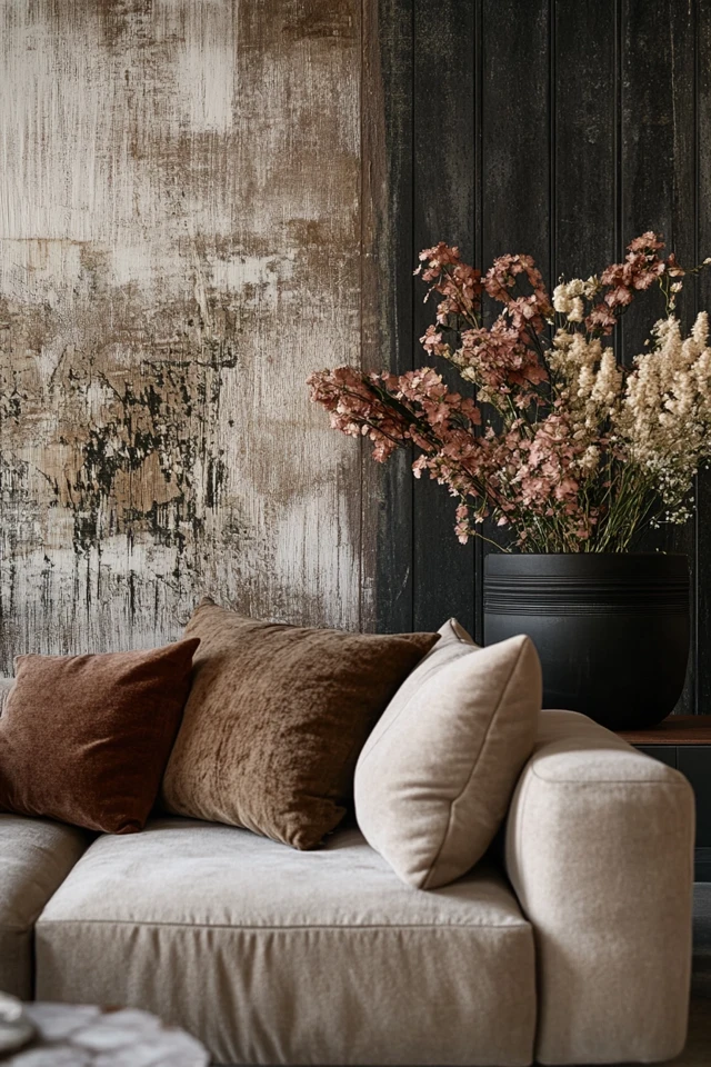
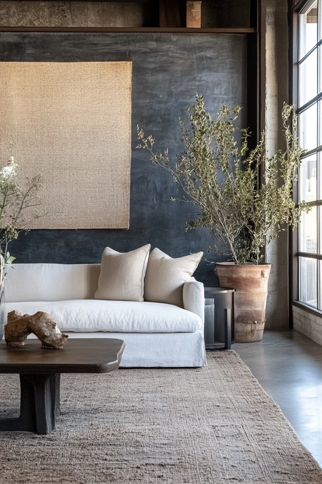
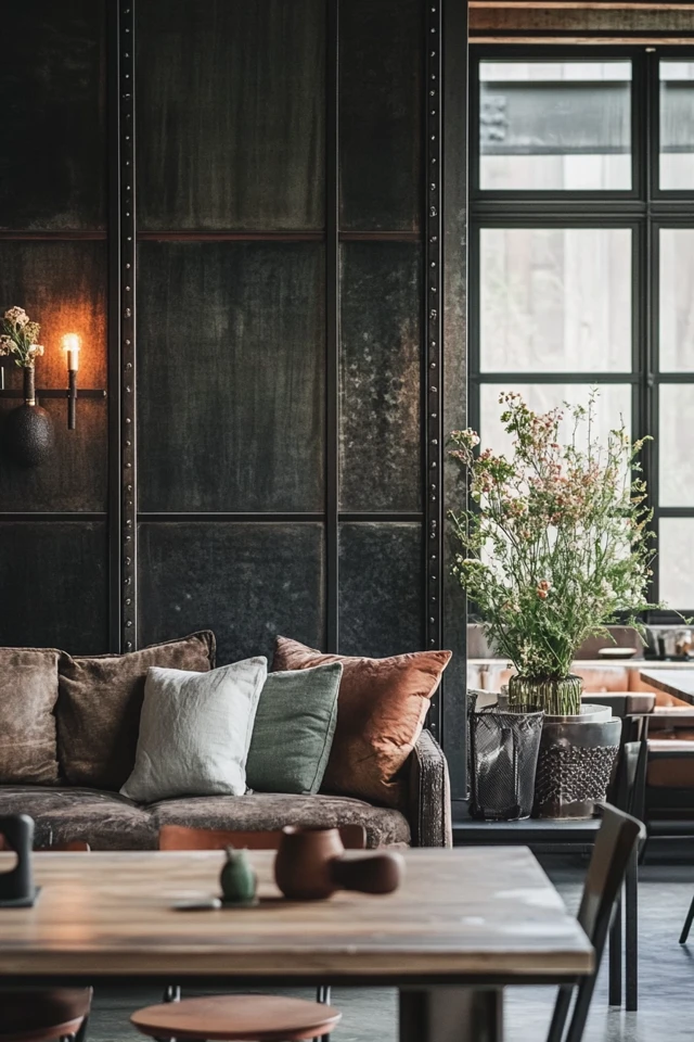
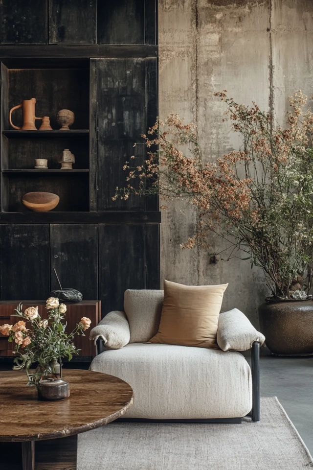

FAQ Section
1. What are the best bold colors to use in industrial design?
Mustard yellow, deep red, emerald green, cobalt blue, and rust orange are popular choices. These hues complement industrial materials while adding vibrancy.
2. How do I avoid overwhelming the space with bold colors?
Use bold colors sparingly and pair them with a neutral base. Limit bold tones to one or two accents per room for a balanced look.
3. Can I use pastel colors in industrial design?
Yes, but sparingly. Soft pastel shades, like dusty pink or pale mint, can work as secondary accents when paired with bold tones and neutral materials.
4. What’s the best way to add bold colors without making permanent changes?
Use decor items like throw pillows, rugs, and artwork. These are easy to swap out and don’t require major renovations.
5. How do I mix warm and cool tones in industrial design?
Balance warm bold colors (like red or orange) with cool neutrals (like gray or black). Likewise, pair cool bold colors (like blue or green) with warm wood tones or brass accents.
Variations
- Monochrome with a Pop: Stick to a black-and-white palette and add a single bold color, like a red chair or a yellow lamp, for a striking contrast.
- Rustic Industrial with Earth Tones: Combine rust orange, olive green, and beige for a more natural, earthy take on bold and neutral mixing.
- Modern Industrial with Jewel Tones: Use emerald green, sapphire blue, or amethyst purple against a gray and black industrial base for a luxurious feel.
How to Showcase It
Living Room
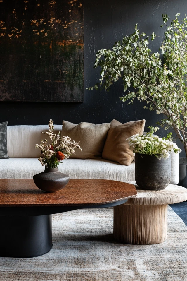
Pair a bold yellow sofa with a black metal coffee table and a concrete floor. Add a patterned rug with neutral and bold hues to tie the look together.
Kitchen
Use cobalt blue or emerald green barstools at a stainless steel kitchen island. Offset the color with black pendant lights and exposed brick walls.
Bedroom
Add a deep red or rust orange throw blanket to a bed with neutral gray bedding. Incorporate a bold wall art piece above a black metal bed frame.
Home Office
Place a mustard yellow chair at a reclaimed wood desk. Add a black-and-white gallery wall for contrast and cohesion.
Occasions to Feature It
- Home Makeovers: Bold accents can dramatically transform a previously neutral industrial space into something unique and vibrant.
- Seasonal Updates: Swap out bold-colored textiles or decor items to reflect seasonal palettes, like warm rust tones for fall or deep greens for winter.
- Everyday Living: Enjoy the balance of calm neutrals and energizing bold colors in your day-to-day environment.
Conclusion
Mixing bold and neutral colors in industrial design is an art that balances rugged charm with vibrant energy. By starting with a neutral base and incorporating bold accents through furniture, textiles, and decor, you can create a space that feels dynamic yet grounded. Whether you’re experimenting with mustard yellow, cobalt blue, or deep red, these pops of color bring personality and warmth to your industrial interiors.
Now it’s your turn—find the bold tones that speak to you, style them alongside neutral elements, and watch your industrial space come to life. Share your results and inspire others to embrace the beauty of bold and neutral contrasts!

