Monochromatic color schemes are the epitome of sophistication in interior design. By focusing on a single color and exploring its shades, tones, and tints, you can create a harmonious, visually striking space. But here’s the thing: monochromatic doesn’t mean boring! It’s all about creating depth and balance to make the space feel dynamic yet cohesive.
The first time I worked with a monochromatic color scheme, I was nervous about the limitations. Would it look flat? Would the lack of contrasting colors make it dull? Spoiler alert: it didn’t. The result was a serene, elegant living room that felt like a breath of fresh air. Guests couldn’t stop complimenting the subtle sophistication, and I realized just how powerful this design approach can be.
Ready to master the art of monochromatic decorating? Let’s dive into the tips, tricks, and strategies that will make your space sing.
What Is a Monochromatic Color Scheme?
A monochromatic color scheme uses one base color and its various shades, tones, and tints. Here’s what that means:
- Shade: Adding black to the base color for a darker version.
- Tint: Adding white to the base color for a lighter version.
- Tone: Adding gray to create a muted variation.
The beauty of this approach lies in its simplicity—it eliminates the guesswork of mixing multiple colors while offering endless opportunities for creative expression.
Benefits of Decorating With a Monochromatic Palette
1. Cohesive Look
Using a single color family ensures everything feels tied together.
2. Calming Atmosphere
Monochromatic schemes are easy on the eyes and create a serene environment.
3. Design Flexibility
From bold and dramatic to soft and subtle, a monochromatic palette can suit any style.
4. Focus on Texture and Details
With color taking a backseat, you can highlight textures, patterns, and shapes.
Now that you know the why, let’s move on to the how!
1. Start With a Base Color You Love
Why It Matters:
Your base color sets the tone for the entire space, so choose wisely.
How to Choose:
- Pick a color that matches the mood you want to create. Blues and greens are calming, while reds and yellows are energizing.
- Consider existing furniture or finishes you want to keep.
- Take into account the natural light in the room. Lighter colors work best in dim spaces, while darker hues thrive in well-lit areas.
Pro Tip: Use a color wheel app to explore variations of your chosen hue.
2. Layer Shades, Tints, and Tones
Why It Works:
Layering creates depth and dimension, preventing the room from feeling flat.
How to Do It:
- Use lighter tints for walls to keep the space bright and airy.
- Incorporate medium tones in furniture or larger decor pieces.
- Add darker shades through accents like rugs, throw pillows, or artwork.
Pro Tip: Aim for a balance of light, medium, and dark tones to create visual harmony.
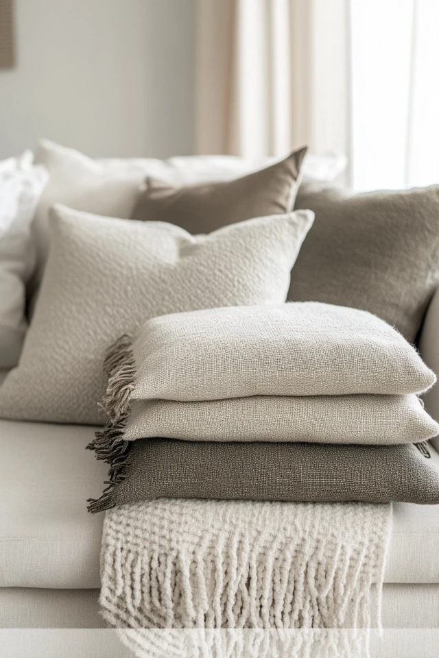
3. Play With Textures and Materials
Why It Works:
Texture adds interest and prevents monotony in a single-color space.
How to Use It:
- Mix matte and glossy finishes for contrast.
- Pair smooth surfaces (like polished wood) with rough ones (like a chunky knit throw).
- Experiment with materials like velvet, leather, metal, and glass.
Pro Tip: Don’t shy away from unexpected textures like grasscloth wallpaper or concrete accents—they’ll make the space unforgettable.
4. Add Subtle Patterns
Why It Works:
Patterns break up the color while keeping the monochromatic theme intact.
How to Use It:
- Incorporate patterned throw pillows or bedding in varying tones of the base color.
- Use a tone-on-tone wallpaper or area rug with a subtle design.
- Add stripes, geometrics, or florals in the same color family for interest.
Pro Tip: Stick to small-scale patterns in minimalist spaces and larger patterns in more eclectic rooms.
5. Use Artwork to Anchor the Room
Why It Works:
Art can add depth and character to a monochromatic design.
How to Do It:
- Choose monochromatic art pieces that echo your color palette.
- Opt for black-and-white prints if your base color is bold.
- Use a statement piece as a focal point on a neutral wall.
Pro Tip: Gallery walls featuring different shades of your base color can make a stunning impact.
6. Incorporate Natural Elements
Why It Works:
Natural materials add warmth and contrast to a single-color scheme.
How to Use It:
- Add wooden furniture or accents in light, medium, or dark stains.
- Use greenery to bring a pop of life to the space—houseplants go with any color palette!
- Incorporate stone, rattan, or bamboo for an organic touch.
Pro Tip: Pair cool-toned palettes (like blues or grays) with warm wood finishes for balance.
7. Play With Lighting
Why It Works:
Lighting enhances the color variations and creates ambiance.
How to Do It:
- Use warm lighting to make darker colors feel cozy and inviting.
- Opt for layered lighting (overhead, task, and ambient) to highlight different areas.
- Install dimmers to adjust the mood depending on the time of day.
Pro Tip: Consider colored LED lighting to subtly enhance the tones of your palette.
8. Mix Modern and Traditional Styles
Why It Works:
Combining styles keeps the room dynamic and visually engaging.
How to Do It:
- Pair a modern monochromatic palette (like black, white, and gray) with traditional furniture.
- Incorporate vintage decor pieces in a single hue for added character.
- Use sleek, contemporary lighting fixtures to tie the look together.
Pro Tip: Keep your base color consistent across styles for a cohesive look.
9. Add Metallic Accents for Glamour
Why It Works:
Metallic finishes add shine and contrast to your color palette.
How to Use It:
- Use gold, brass, or silver accents in light fixtures, hardware, or decorative objects.
- Choose a single metallic finish to keep the look cohesive.
- Pair metallics with matte tones for a luxurious feel.
Pro Tip: Rose gold and copper pair beautifully with pink and warm neutral palettes.
10. Don’t Forget the Ceiling and Trim
Why It Works:
These often-overlooked areas can enhance your monochromatic design.
How to Use It:
- Paint the ceiling a lighter tint of your base color for a cohesive look.
- Use a darker shade for crown molding or baseboards to frame the room.
- Incorporate textured or patterned ceiling treatments for added interest.
Pro Tip: Keep trim and ceilings in high-gloss finishes to reflect light and make the space feel larger.
Picture Gallery



Conclusion
Decorating with monochromatic color schemes is a masterclass in creating simplicity with depth. By layering shades, incorporating textures, and thoughtfully choosing accents, you can turn any space into a cohesive, elegant retreat.
The beauty of this approach is its versatility—it can be as bold or as subtle as you like, depending on the color you choose and how you style it. Whether you’re a fan of serene blues, dramatic blacks, or cheerful yellows, a monochromatic design allows you to explore the full spectrum of a single hue.
So go ahead, pick a color you adore, and watch your space transform into a harmonious work of art.
FAQs
1. Is a monochromatic color scheme suitable for small spaces?
Absolutely! Lighter tones of a single color can make a small room feel larger and more open.
2. How do I avoid a monochromatic room looking flat?
Incorporate different textures, materials, and finishes to add depth and dimension to the space.
3. Can I mix styles with a monochromatic palette?
Yes! Monochromatic schemes are versatile and work well across modern, traditional, and eclectic styles.
4. What’s the best way to add contrast in a monochromatic room?
Use varying shades, tones, and tints of your base color, or incorporate metallic or natural accents for contrast.
5. How do I choose the right base color?
Consider the mood you want to create, the room’s natural lighting, and the existing furniture or decor you plan to keep.


