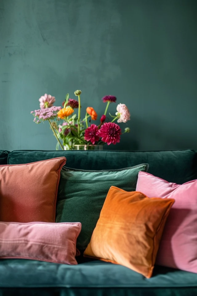
Selecting the perfect color palette for your home decor can be both exciting and daunting. Colors have a profound impact on our emotions and the overall ambiance of a space. As an architect and interior designer with expertise in evidence-based design, I can guide you through the process of choosing colors that not only look beautiful but also enhance your well-being. A thoughtfully chosen color palette can transform your home into a harmonious and inviting sanctuary.
In today’s world, where we spend significant time indoors, the colors we surround ourselves with can greatly influence our mood and behavior. Whether you’re aiming for a serene bedroom, a lively living room, or a cozy kitchen, selecting the right colors is essential. Evidence-based design principles can help us understand how different colors affect our mental and emotional states, ensuring that your home becomes a place of comfort and joy.
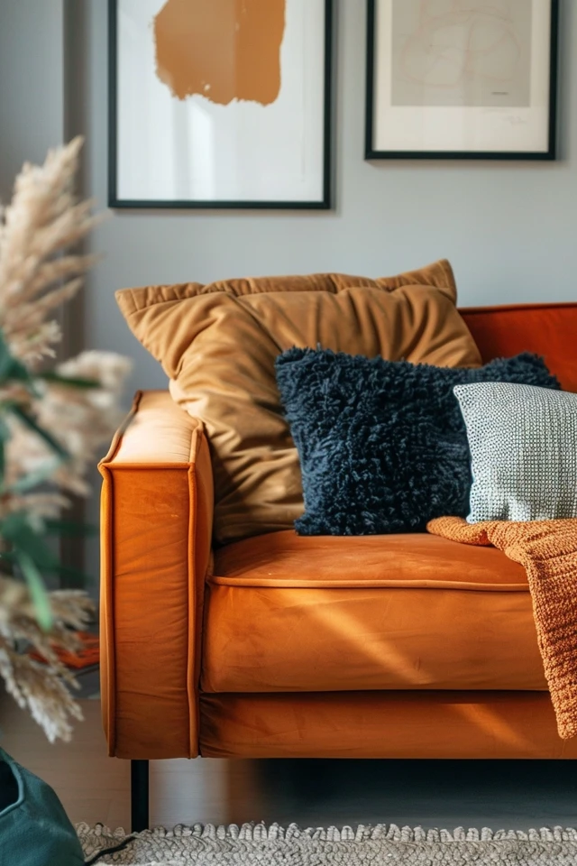
In this blog post, we will explore the key considerations for choosing the perfect home decor color palette. From understanding color psychology to coordinating with existing decor, these tips will help you create a cohesive and visually appealing space that reflects your personal style.
Key Takeaways
- Understand color psychology to choose hues that evoke desired emotions.
- Consider your existing decor and how new colors will integrate.
- Test colors with samples before committing to a full palette.
- Use the 60-30-10 rule for balanced and harmonious color distribution.
- Incorporate accent colors to add depth and interest to your decor.
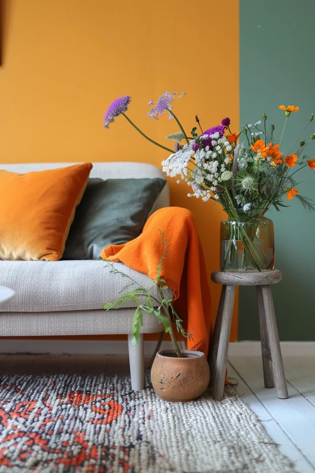
1. Understand Color Psychology
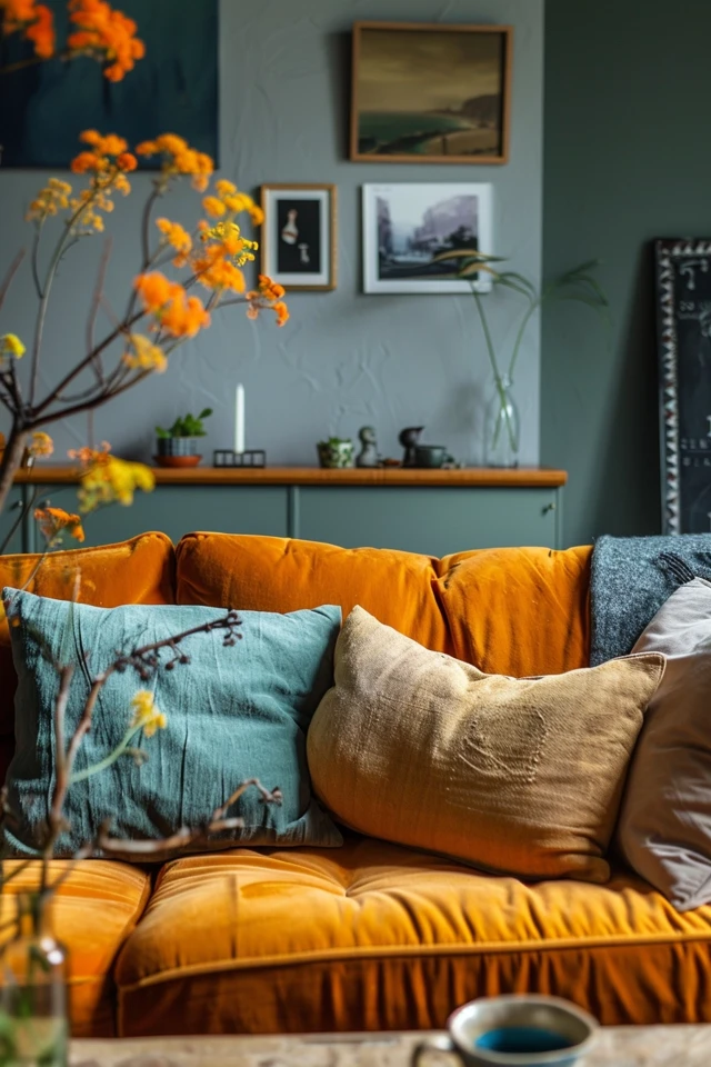
Color psychology is the study of how colors affect our emotions and behaviors. By understanding the psychological impact of different hues, you can choose a color palette that aligns with the mood you want to create in each room. For instance, blues and greens are often associated with calmness and relaxation, making them ideal for bedrooms and bathrooms. On the other hand, warm colors like reds, oranges, and yellows can energize and stimulate, perfect for social spaces like the living room or kitchen.
Evidence-based design supports the idea that color can influence our well-being. Cool colors can reduce stress and promote tranquility, while warm colors can increase energy and stimulate creativity. When choosing your color palette, consider the function of each room and the emotional response you want to elicit.
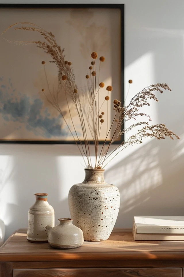
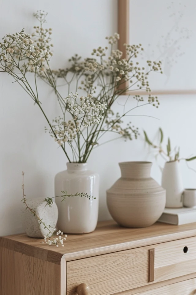
Neutral colors, such as whites, grays, and beiges, provide a versatile backdrop that can be paired with a variety of accent colors. They can create a sense of balance and simplicity, making your home feel more open and airy. Understanding color psychology can help you make informed decisions that enhance the overall atmosphere of your home.
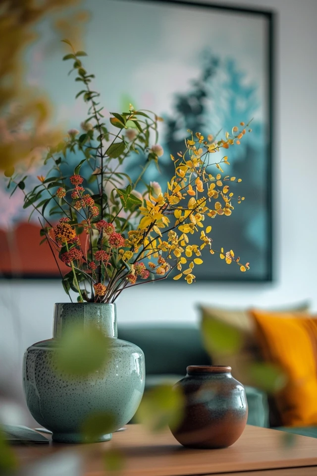
2. Consider Your Existing Decor
When selecting a new color palette, it’s essential to consider your existing decor and how the new colors will integrate with what you already have. Take stock of your furniture, artwork, and accessories to ensure that your chosen colors complement and enhance the overall aesthetic of your home.
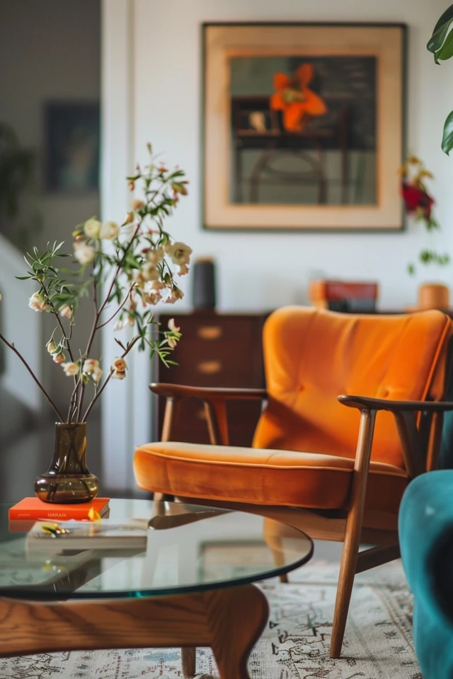
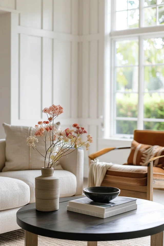
Evidence-based design emphasizes the importance of harmony and cohesion in creating visually pleasing spaces. Choose colors that either match or contrast pleasantly with your existing decor. For instance, if you have a lot of wooden furniture, consider using colors that highlight the natural tones of the wood. If your decor features bold patterns, opt for a more subdued color palette to avoid visual clutter.
In addition to considering the colors of your existing decor, think about the style and mood you want to achieve. A modern, minimalist space might benefit from a monochromatic color scheme with pops of vibrant color, while a traditional or rustic space might look best with a warm, earthy palette. Ensuring that your new colors work well with your existing decor will create a seamless and cohesive look.
3. Test Colors with Samples
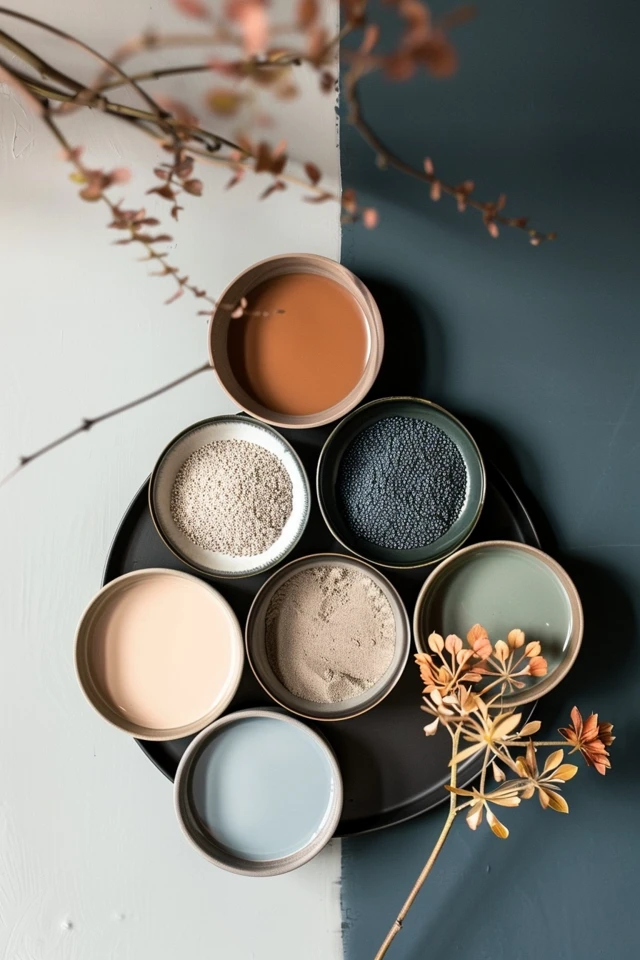
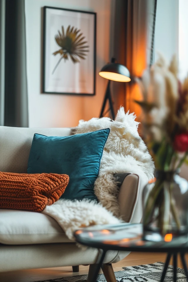
Before committing to a full color palette, it’s important to test your chosen colors with samples. Paint small sections of your walls or use sample boards to see how the colors look in different lighting conditions and at various times of the day. This step is crucial in ensuring that the colors you choose will look as good in your home as they do in your imagination.
Evidence-based design highlights the importance of considering natural and artificial lighting when selecting colors. A color that looks perfect in a well-lit showroom might appear entirely different under the lighting conditions in your home. Testing samples allows you to see how the colors interact with your lighting and other elements in the room.
Don’t rush the testing phase; live with the samples for a few days to get a true sense of how the colors feel in your space. Pay attention to how they look in the morning, afternoon, and evening light. This process will help you make a confident decision and avoid costly mistakes.
4. Use the 60-30-10 Rule
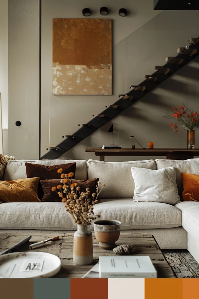
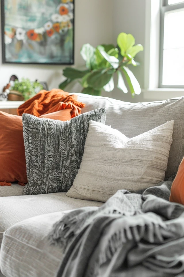
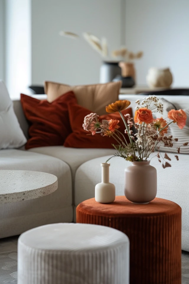
The 60-30-10 rule is a classic interior design guideline that helps create a balanced and harmonious color scheme. According to this rule, 60% of the room should be a dominant color, 30% a secondary color, and 10% an accent color. This distribution ensures that the colors work together seamlessly and that no single color overwhelms the space.
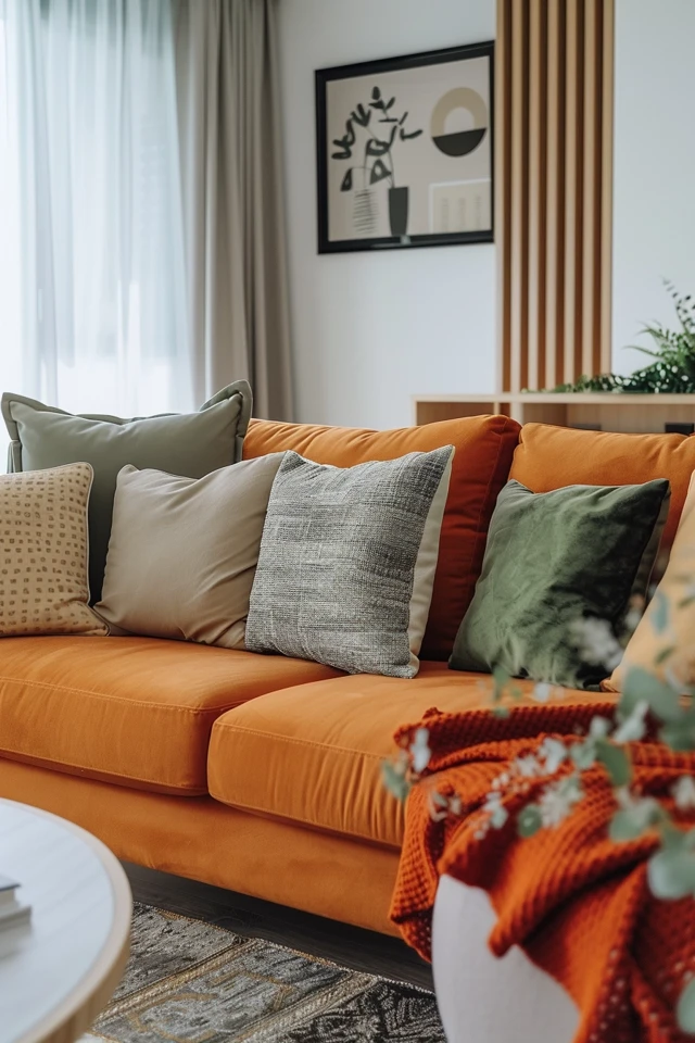
Evidence-based design supports the use of this rule to create visually appealing and well-proportioned spaces. The dominant color is typically used on walls, the secondary color on upholstery and larger pieces of furniture, and the accent color on accessories and decor items. This approach creates a cohesive look and allows you to introduce bold colors in a controlled and balanced way.
When applying the 60-30-10 rule, start by selecting your dominant color. This should be a color that sets the tone for the room and is easy to live with on a large scale. Next, choose a secondary color that complements the dominant color and adds depth to the space. Finally, select an accent color that provides a pop of interest and personality. This method ensures a well-rounded and visually satisfying color scheme.
5. Incorporate Accent Colors
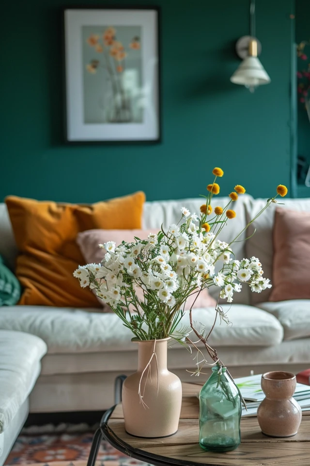
Accent colors are the finishing touch that can elevate your home decor and add personality to your space. These colors are typically used sparingly but have a significant impact on the overall look and feel of the room. Incorporating accent colors can add depth, contrast, and interest to your decor.
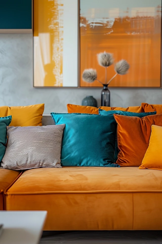
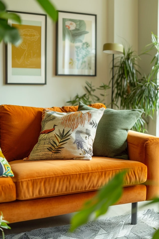
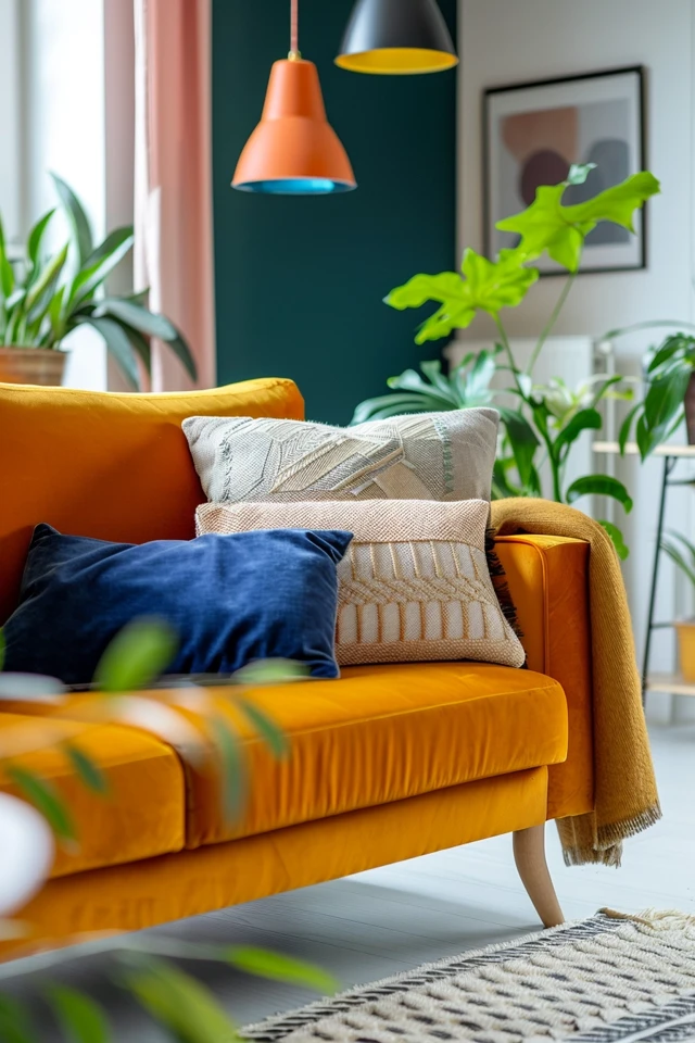
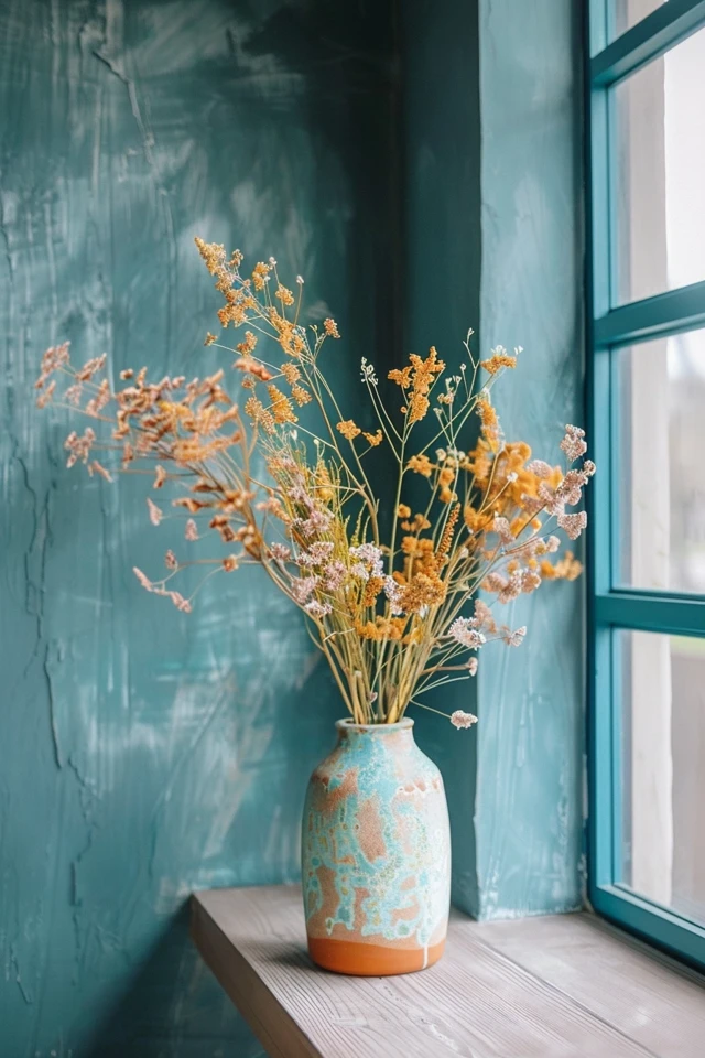
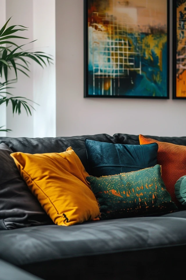
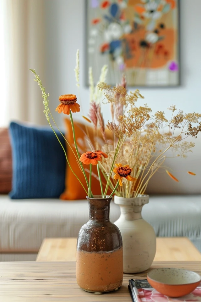
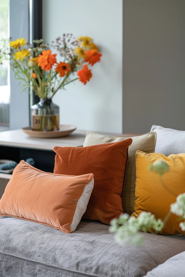
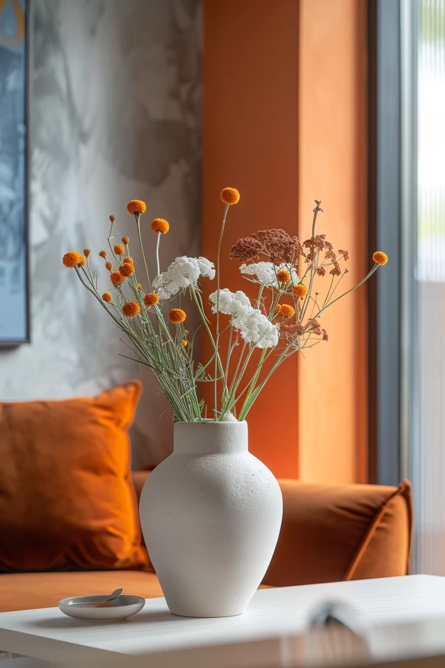
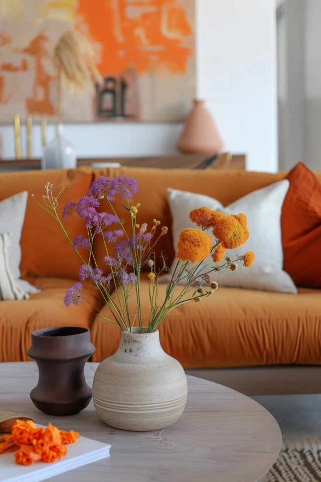
Evidence-based design suggests that accent colors can be used to draw attention to specific areas or features within a room. For example, you might use a bold color to highlight a piece of artwork, a feature wall, or a piece of furniture. Accent colors can also be introduced through accessories like cushions, rugs, vases, and curtains.
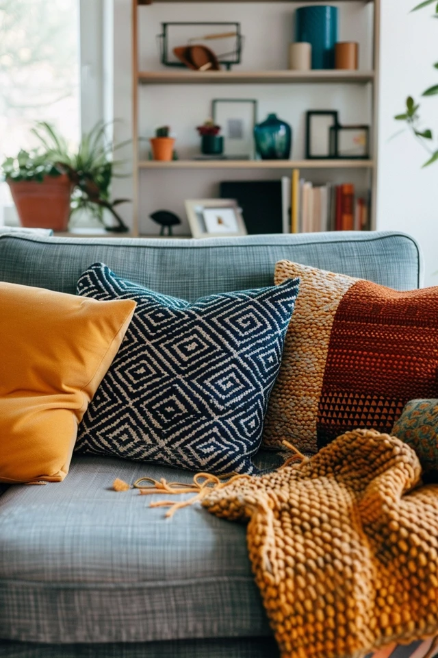
When choosing accent colors, consider selecting hues that contrast with your dominant and secondary colors to create visual interest. If your main palette is neutral, bold accent colors can add a striking touch. Conversely, if your primary colors are already vibrant, opt for more subdued accent colors to maintain balance.
Conclusion
Choosing the perfect home decor color palette is an exciting journey that can transform your living space into a harmonious and inviting haven. By understanding color psychology, considering your existing decor, testing colors with samples, using the 60-30-10 rule, and incorporating accent colors, you can create a cohesive and visually appealing environment that reflects your personal style.
As an architect and interior designer with expertise in evidence-based design, I encourage you to embrace these strategies to make informed and confident color choices. A well-chosen color palette not only enhances the aesthetic appeal of your home but also supports your emotional and mental well-being.
Remember, the key to a successful color scheme is balance and harmony. By following these tips, you can achieve a home decor color palette that is both beautiful and functional. Happy decorating!
Inspirational Pictures
