Selecting the perfect color scheme for your home can be a game-changer in creating a cohesive, inviting, and visually stunning space. Colors set the mood, influence emotions, and reflect your personal style. However, with countless shades and combinations available, deciding on the right palette can feel overwhelming.
This guide will walk you through the steps of choosing a color scheme that works seamlessly for your home, ensuring every room feels harmonious and stylish.
1. Understand the Basics of Color Theory
Before diving into color selection, it’s helpful to understand color theory, which explains how colors interact and complement each other.
Key Terms:
- Primary Colors: Red, blue, and yellow.
- Secondary Colors: Green, orange, and purple, created by mixing primary colors.
- Tertiary Colors: Shades created by mixing primary and secondary colors.
- Color Wheel: A visual representation of color relationships.
Popular Color Schemes:
- Monochromatic: Uses variations of a single color.
- Analogous: Combines colors next to each other on the color wheel (e.g., blue, green, and teal).
- Complementary: Pairs colors opposite each other on the wheel (e.g., blue and orange).
- Triadic: Features three evenly spaced colors on the wheel (e.g., yellow, blue, and red).
Pro Tip: Use complementary or analogous schemes for balance, and incorporate neutral tones to avoid overstimulation.
2. Determine the Mood for Each Room
Colors have the power to influence mood and energy, so think about how you want each space in your home to feel.
Mood and Color Pairings:
- Calm and Relaxing: Soft blues, greens, and neutrals for bedrooms and bathrooms.
- Energizing and Vibrant: Bold yellows, oranges, or reds for kitchens and home offices.
- Warm and Inviting: Earthy tones like terracotta, beige, and warm browns for living rooms.
- Sophisticated and Elegant: Deep jewel tones like emerald green, navy blue, or charcoal gray.
Pro Tip: Use lighter shades in small or dimly lit rooms to create a sense of space and darker tones in larger areas for coziness.
3. Choose a Dominant Color
Select one dominant color to serve as the foundation for your palette. This color will be used for walls, large furniture, or flooring, setting the overall tone of the room.
Tips for Choosing a Dominant Color:
- Look at existing furniture or decor for inspiration.
- Consider the natural lighting in your space—cool tones for bright rooms and warm tones for darker spaces.
- Use neutral tones (like gray, beige, or white) for flexibility in layering other colors.
Pro Tip: Paint swatches on your walls and observe them at different times of the day to see how lighting affects the hue.
4. Add Accent Colors
Accent colors add personality and dimension to your space, complementing the dominant shade. They can be introduced through furniture, decor, or smaller design elements.
How to Use Accent Colors:
- Pair two accent colors with the dominant hue for balance.
- Use accent colors sparingly to avoid overwhelming the space.
- Incorporate them in throw pillows, curtains, rugs, or artwork.
Pro Tip: Follow the 60-30-10 Rule:
- 60% Dominant Color (walls, large furniture).
- 30% Secondary Color (textiles, smaller furniture).
- 10% Accent Color (decor items, artwork).
5. Consider Neutral and Transitional Spaces
Neutral colors like white, gray, or beige serve as a backdrop for bolder hues and create continuity throughout your home.
Neutral Color Ideas:
- Warm Neutrals: Beige, cream, taupe for cozy, inviting spaces.
- Cool Neutrals: Gray, white, or soft blue for modern, minimalistic looks.
- Greige: A versatile mix of gray and beige, suitable for any design style.
Pro Tip: Use consistent neutral tones in hallways or transitional spaces to tie together different color schemes from room to room.
6. Don’t Forget Texture and Material Finishes
The way colors look in your space can change based on the texture and materials you use. Matte finishes appear softer, while glossy surfaces can make colors look brighter and more dynamic.
Tips for Using Texture:
- Pair smooth, glossy materials like marble or glass with soft, matte textures like linen or wood.
- Introduce patterns, such as rugs or wallpaper, to add depth to monochromatic schemes.
- Use metallic finishes (gold, silver, or bronze) for subtle highlights in accent colors.
Pro Tip: Test your color choices on multiple surfaces, including walls, furniture, and fabric swatches, to ensure consistency.
7. Incorporate Natural Elements
Nature-inspired tones bring warmth and tranquility to your home. Incorporate earthy hues and organic materials to complement your color scheme.
Natural Color Palette Ideas:
- Earthy Greens and Browns: Inspired by forests and plants.
- Sky and Ocean Blues: Calm and refreshing.
- Terracotta and Warm Beige: Grounding and cozy.
Pro Tip: Combine natural colors with real elements like wood furniture, stone accents, or indoor plants for a cohesive look.
8. Test Before You Commit
Testing is a crucial step to avoid costly mistakes. Use paint samples, mood boards, or digital tools to visualize your color scheme.
Testing Tips:
- Apply paint samples to multiple walls to observe how lighting affects the color.
- Use online room simulators to test different color combinations virtually.
- Create a mood board with swatches of paint, fabric, and materials to see how everything works together.
Pro Tip: Remember that artificial lighting can alter the appearance of colors, so test during both day and night.
9. Stick to a Cohesive Palette
To maintain harmony, stick to a limited color palette throughout your home. A cohesive design feels polished and well-thought-out.
How to Achieve Cohesion:
- Use similar shades or tones in adjacent rooms for flow.
- Incorporate repeating accent colors in decor pieces across different spaces.
- Choose a common neutral to unify the entire home.
Pro Tip: Add subtle variety by experimenting with patterns or textures within the same palette.
10. Trust Your Personal Style
While following design principles is important, your home should ultimately reflect your personality and style. Choose colors that make you happy and feel comfortable.
Express Your Style:
- Add a bold, unexpected hue in a smaller space like a powder room or home office.
- Incorporate your favorite colors in subtle ways, like through decor or artwork.
- Mix trends with timeless classics for a look that feels unique but not dated.
Pro Tip: Take inspiration from fashion, travel, or nature to create a palette that feels authentic to you.
Picture Gallery
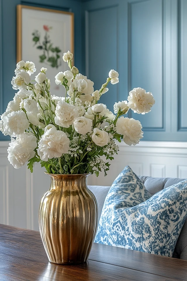
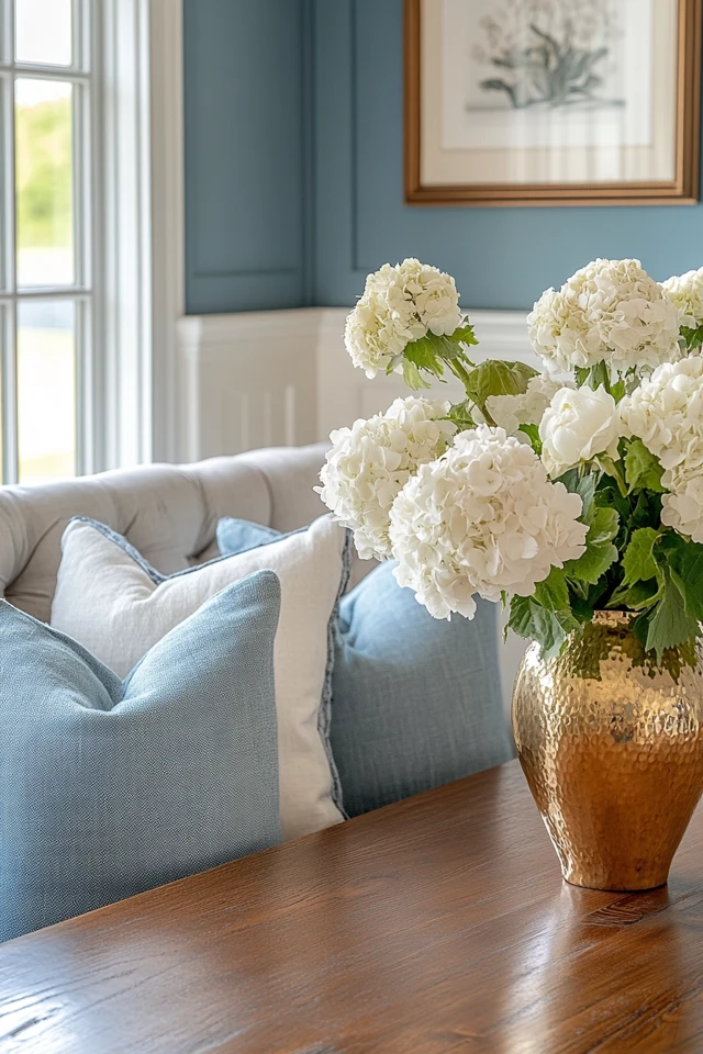
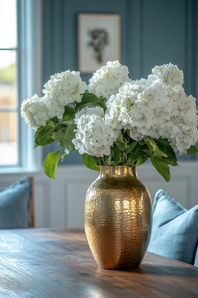
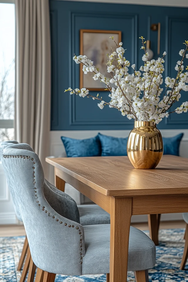
Conclusion
Choosing the perfect color scheme for your home is all about creating a balance between practicality and personality. By understanding color theory, considering the mood you want to evoke, and incorporating textures and natural elements, you can design a space that feels cohesive, inviting, and timeless.
With these steps, you’ll confidently create a color palette that not only reflects your personal style but also enhances the functionality and beauty of your home.
FAQ
1. How many colors should I include in my home color scheme?
Aim for three main colors: one dominant, one secondary, and one accent. This creates a balanced and harmonious look.
2. What colors make a small room look bigger?
Light, neutral colors like white, beige, or pale gray create the illusion of space by reflecting more light.
3. Can I mix warm and cool tones in the same home?
Yes! Balance warm and cool tones by using neutral colors to bridge the two. For example, pair warm wood tones with cool gray accents.
4. How do I choose a color scheme that works for an open floor plan?
Stick to a cohesive palette with slight variations in shades for each area to create a seamless flow between spaces.
5. What’s the best way to experiment with bold colors?
Start small by adding bold colors through accessories, accent walls, or decor items. This lets you test the color without overwhelming the space.


