Before Reading this Article, Hire Us As Your Designer or Take a Look at My Top 3 Amazon Picks!
If you are looking to blend Amazon's furniture finds with a personalized touch for your space, check out my portfolio, and hire us! You'll get 3 Idea boards, 2 Concept Boards, 2 Realistic Renderings, a Floor Plan, and a Shopping List! Everything's online, plus a 25% discount on your first online interior design project with my Havenly Promo code 4c7441bcfb. With over 2,000 designs since 2017 and top US brand partnerships, your project is in expert hands. US only. Ready to start?
Creating a Harmonious Scandinavian Home with the Right Color Palette
Selecting the right color palette is crucial for achieving the serene and inviting atmosphere characteristic of Scandinavian design. Known for its simplicity, functionality, and connection to nature, Scandinavian design utilizes a harmonious blend of colors to create spaces that are both beautiful and comfortable. As an architect and interior designer specializing in evidence-based design, I understand how the right color choices can transform a home.
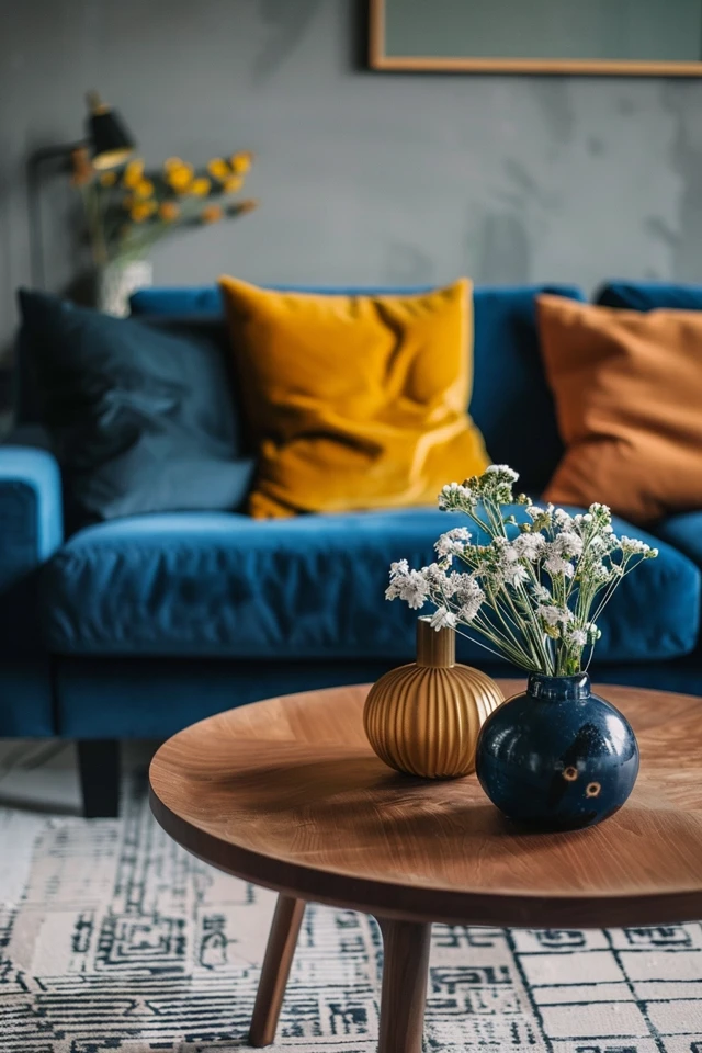
In this guide, we will explore how to choose the best Scandinavian color palette for your home. From understanding the foundational colors to incorporating accents and natural elements, we will cover all the aspects necessary to achieve a cohesive and stylish look. Whether you are redecorating a single room or your entire home, these tips will provide you with the inspiration and guidance you need.
Imagine stepping into a home where every color works together to create a calming and cohesive environment. This is the essence of Scandinavian design, and with a few thoughtful choices, you can bring this aesthetic into your own home. Let’s dive into how to choose the best Scandinavian color palette for your home.
Key Takeaways
- Neutral Base Colors: Embrace whites, grays, and beiges.
- Natural Accents: Incorporate wood tones and earthy shades.
- Muted Hues: Add subtle pops of color with soft, muted shades.
- Contrast and Balance: Use darker tones sparingly to create depth and contrast.
- Cohesive Flow: Ensure a seamless transition of colors between rooms.
1. Embrace Neutral Base Colors
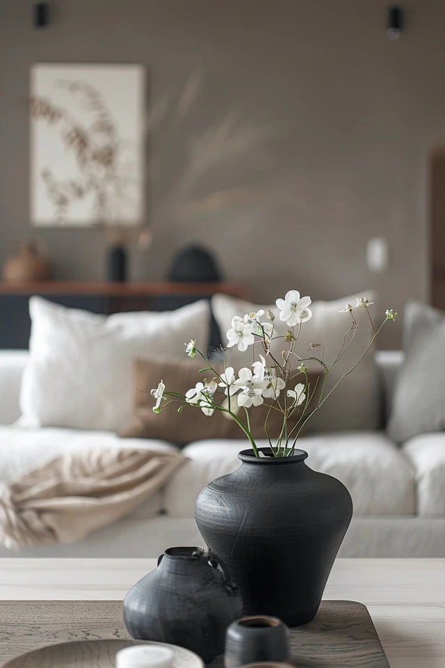
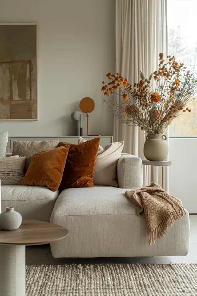
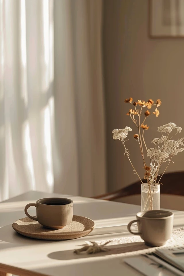
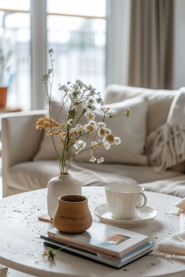
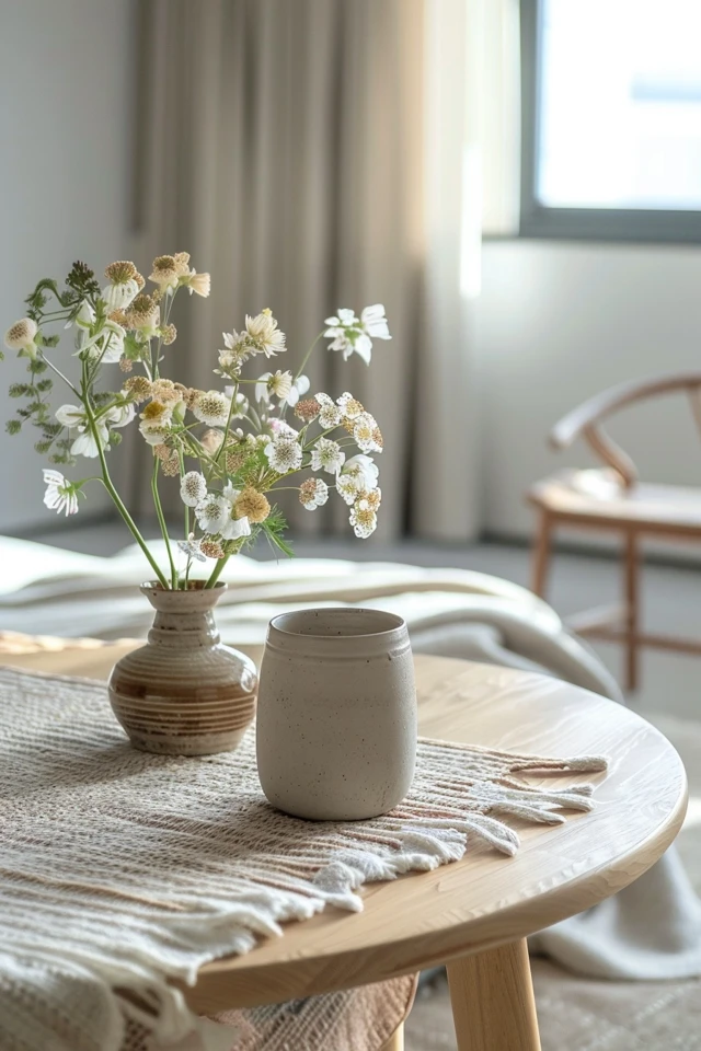
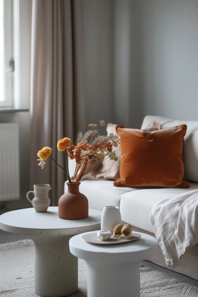
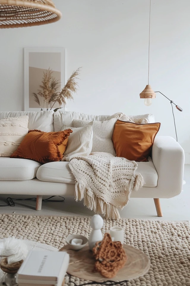
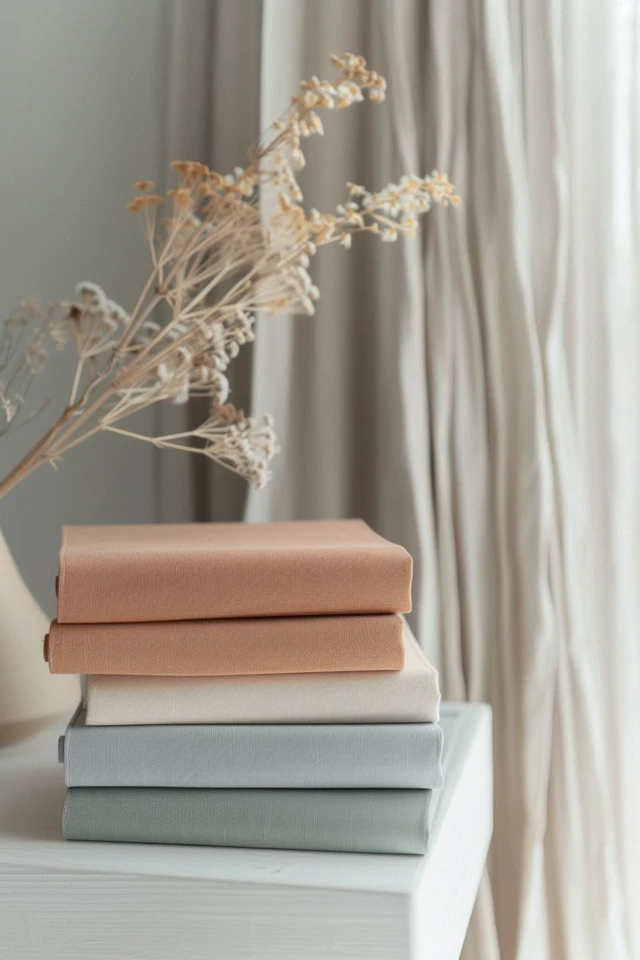
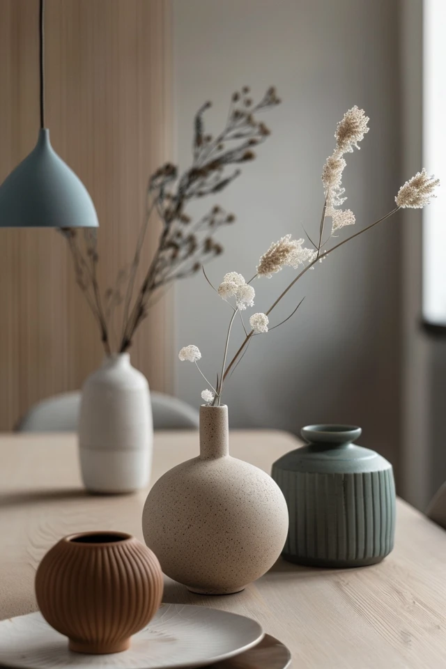
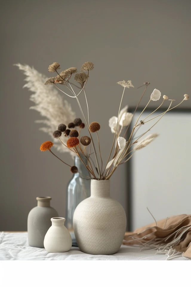
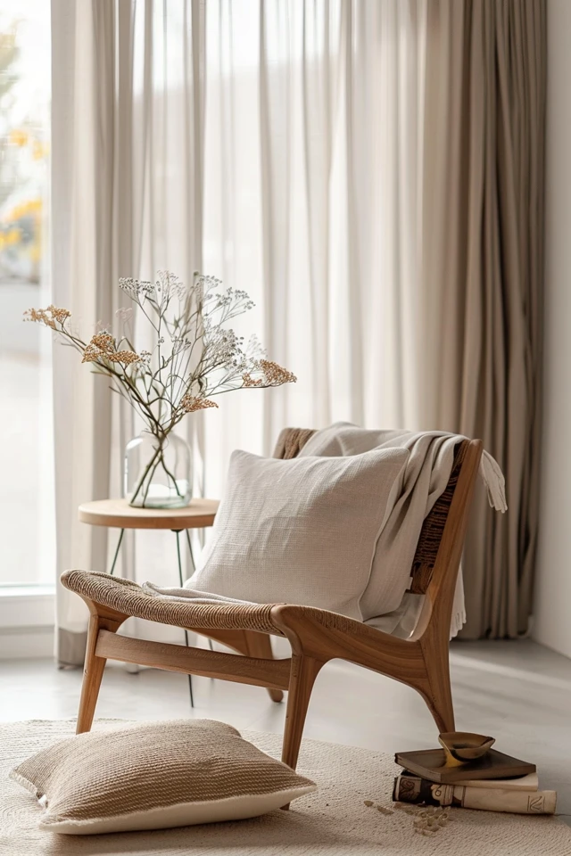
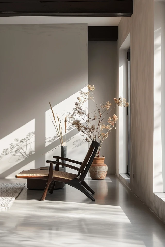
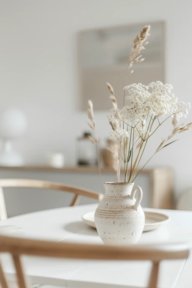
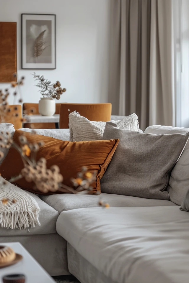
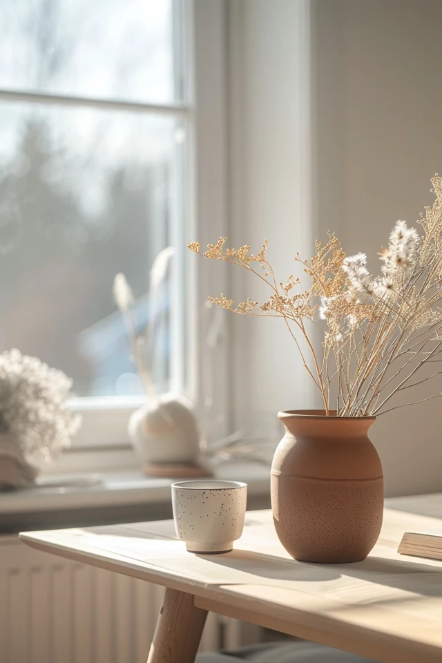
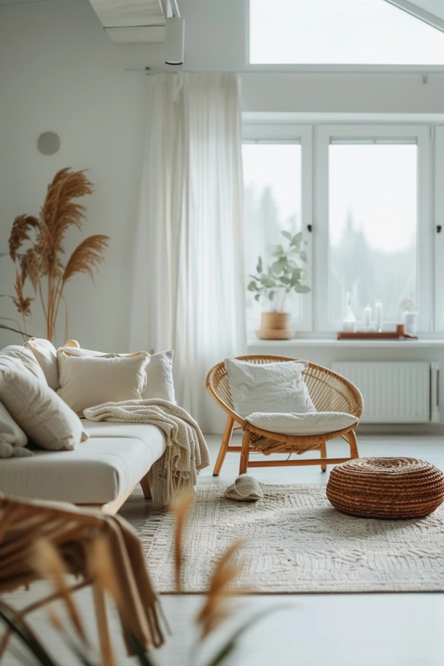
The foundation of any Scandinavian color palette is a range of neutral base colors. Whites, light grays, and beiges create a clean and serene backdrop that enhances the sense of space and light. These colors reflect natural light, making rooms feel brighter and more airy.
Suggested Combinations:
- Walls: Pure white (e.g., Benjamin Moore Chantilly Lace) or light gray (e.g., Sherwin-Williams Repose Gray)
- Floors: Light wood tones or whitewashed wood
- Furniture: White or light gray upholstery
- Textiles: Neutral-colored curtains, cushions, and rugs
2. Incorporate Natural Accents
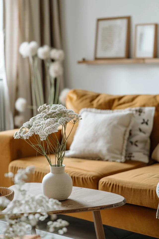
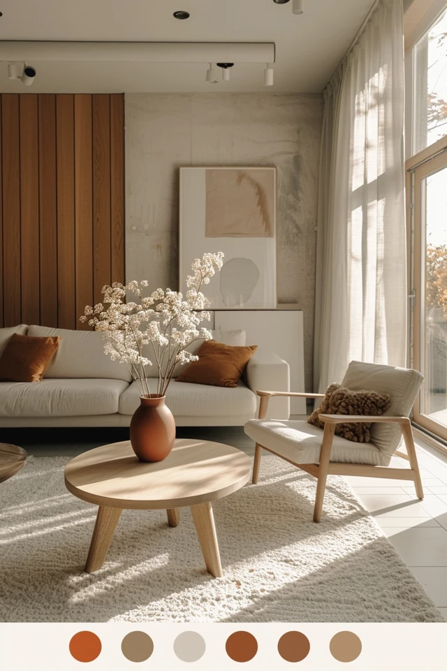
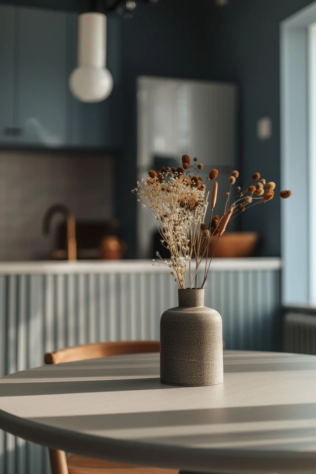
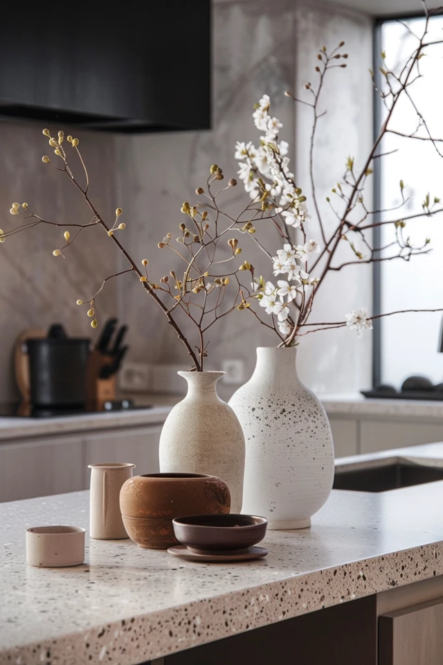
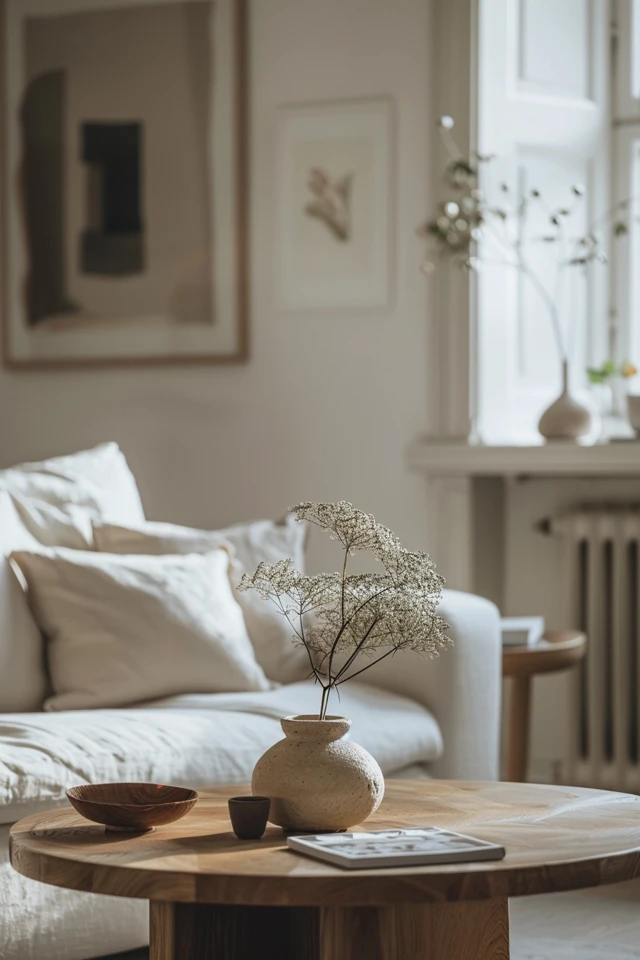
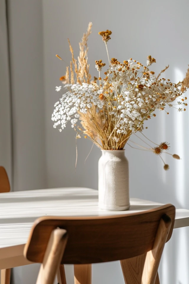
Natural accents are essential for adding warmth and texture to a Scandinavian color palette. Wood tones, whether in furniture, flooring, or decor, bring an organic and cozy feel to the space. Choose light-colored woods like oak, birch, and pine for a true Nordic look.
Suggested Combinations:
- Furniture: Light wood dining tables, chairs, and shelving units
- Accents: Wooden picture frames, bowls, and trays
- Flooring: Light wood or wood-look tiles
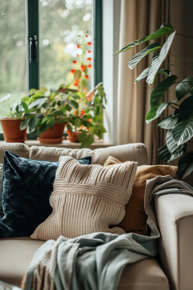
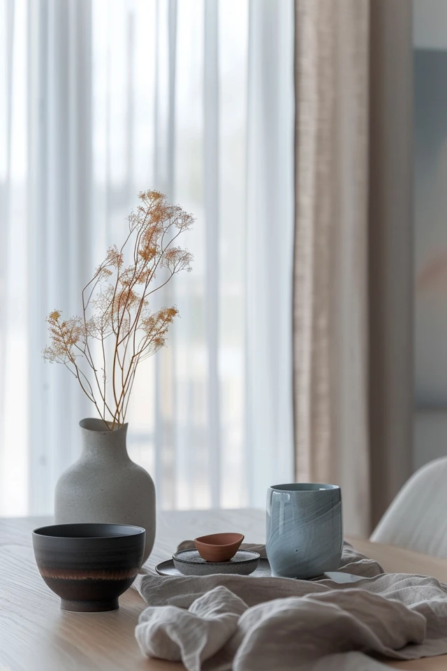
- Textiles: Linen and cotton fabrics in natural shades
3. Add Muted Hues
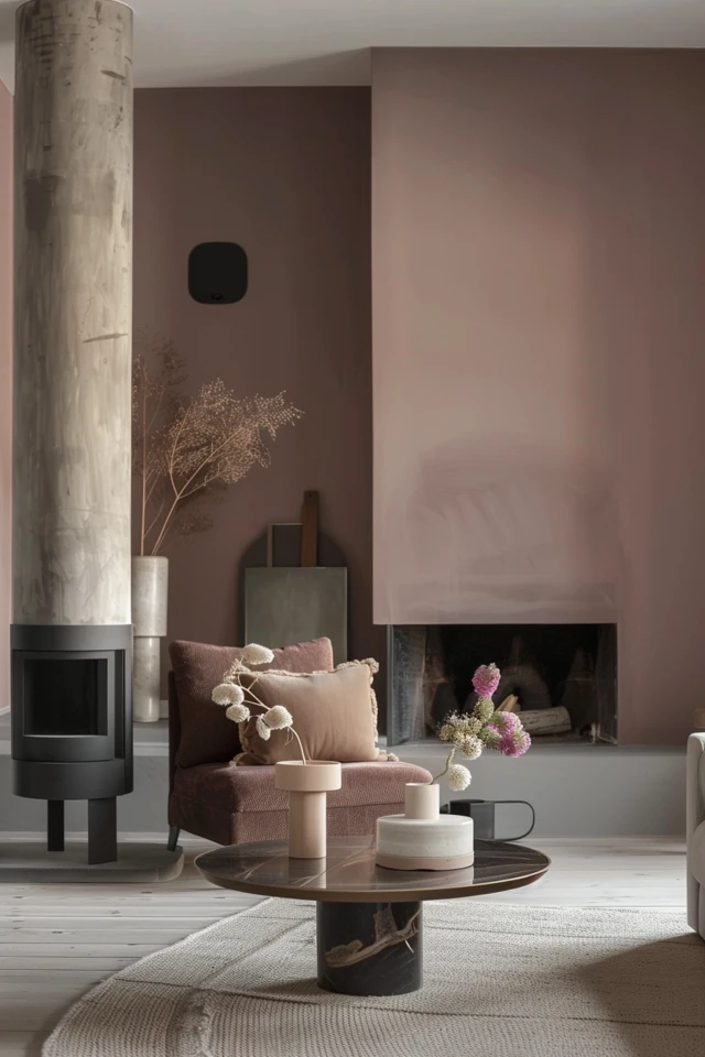
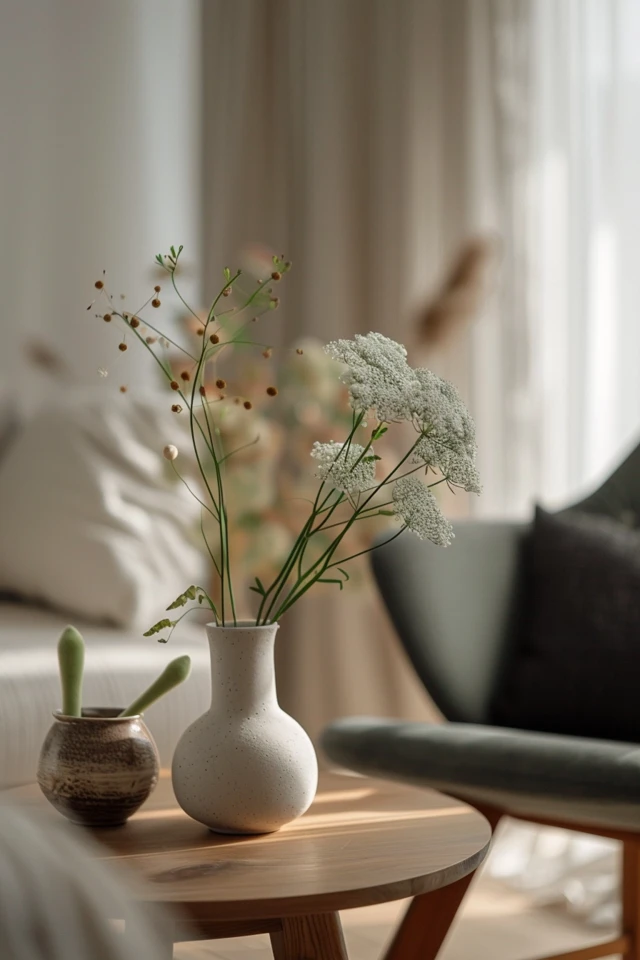
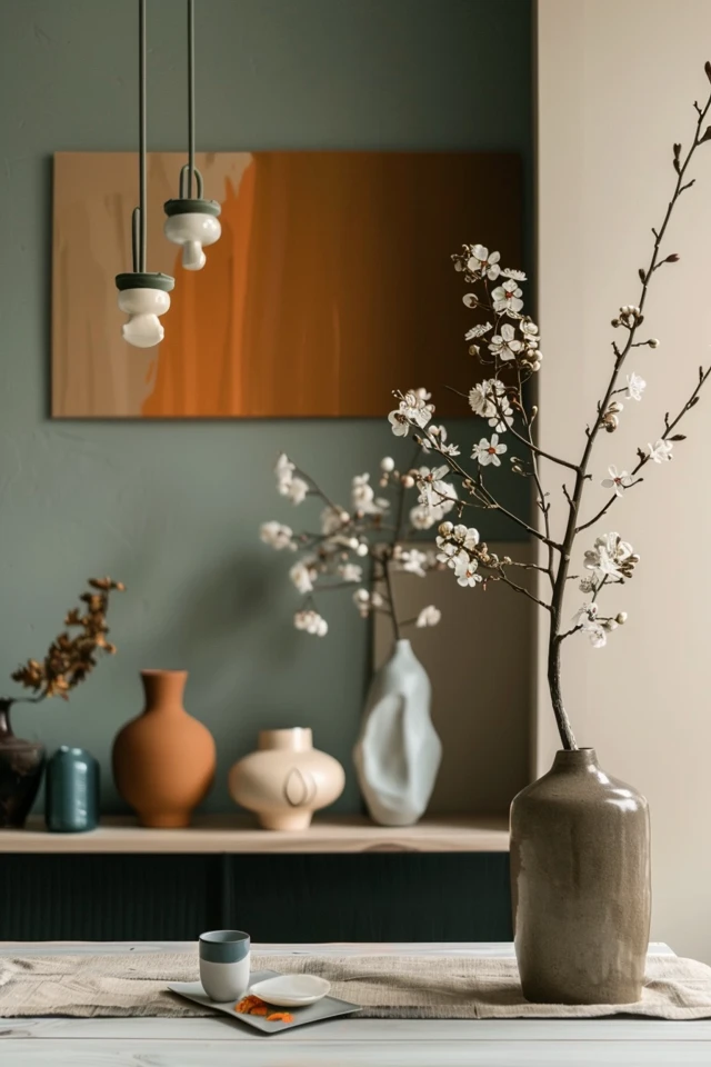
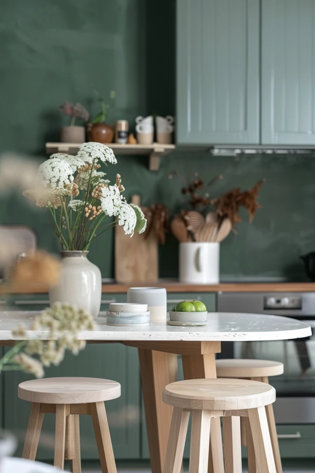
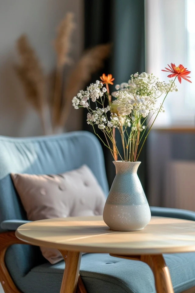
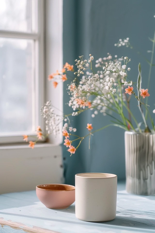
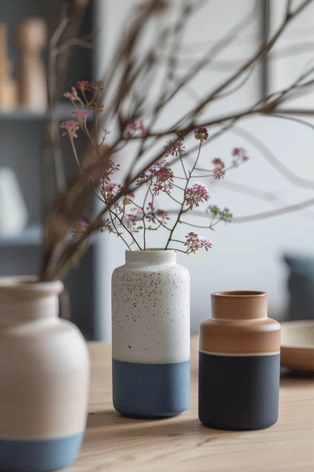
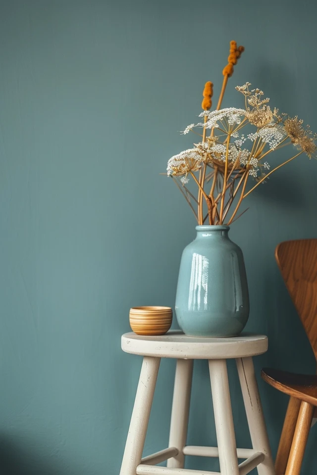
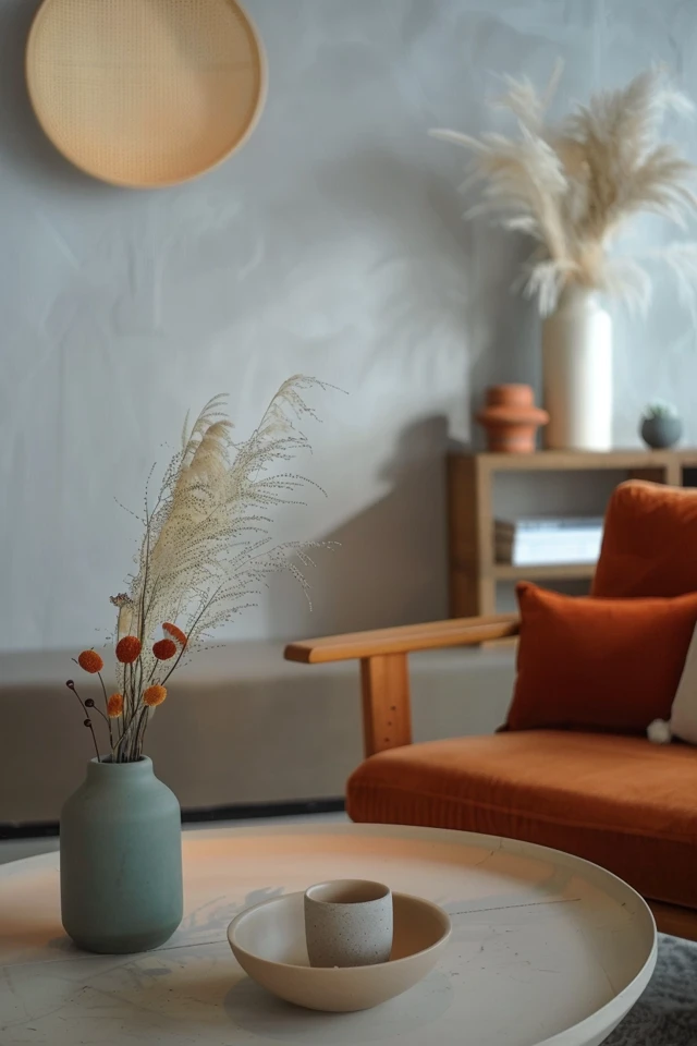
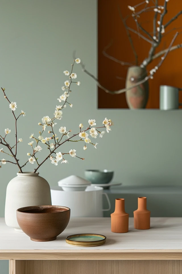
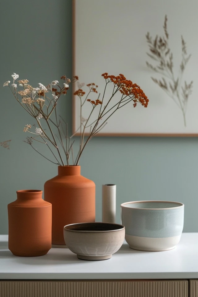
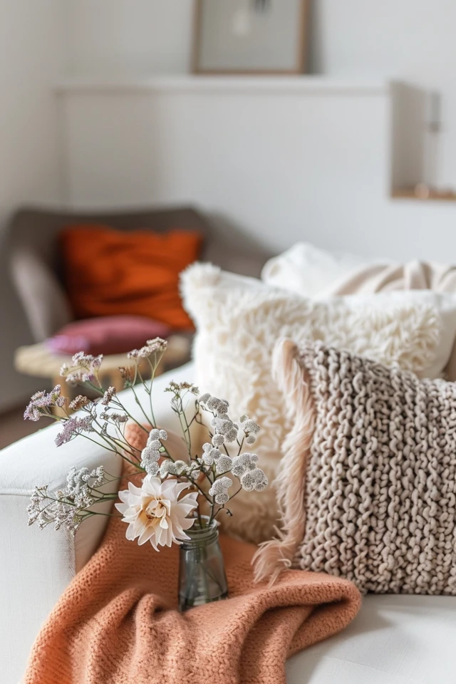
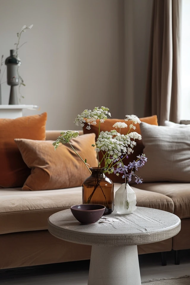
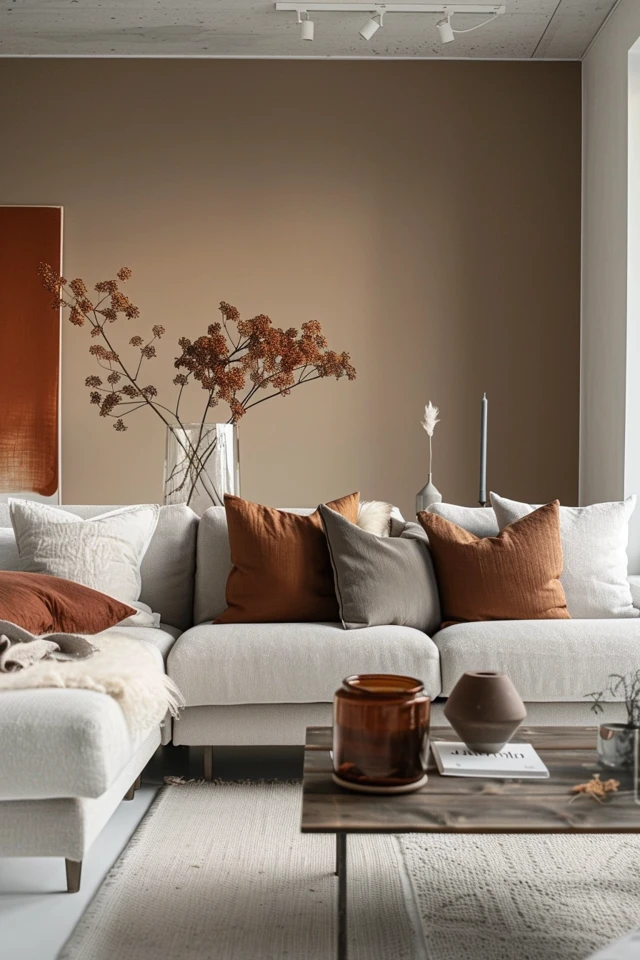
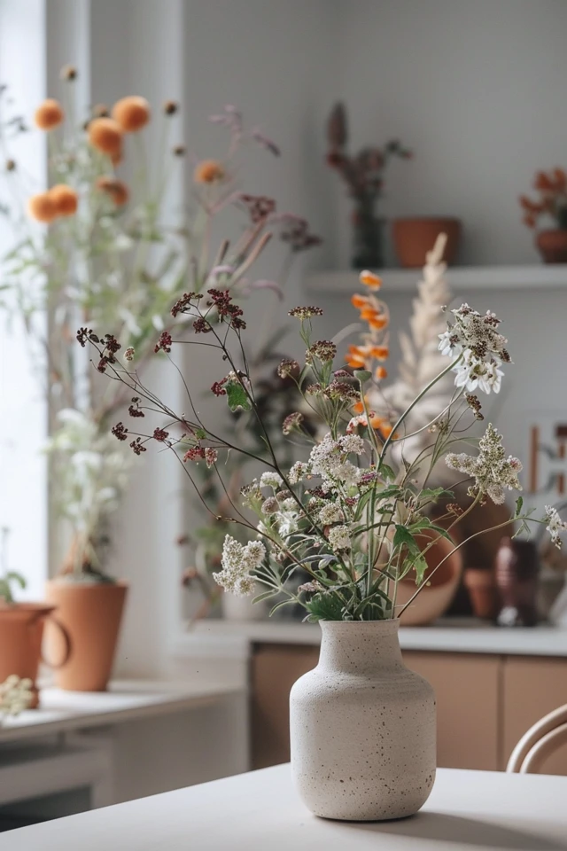
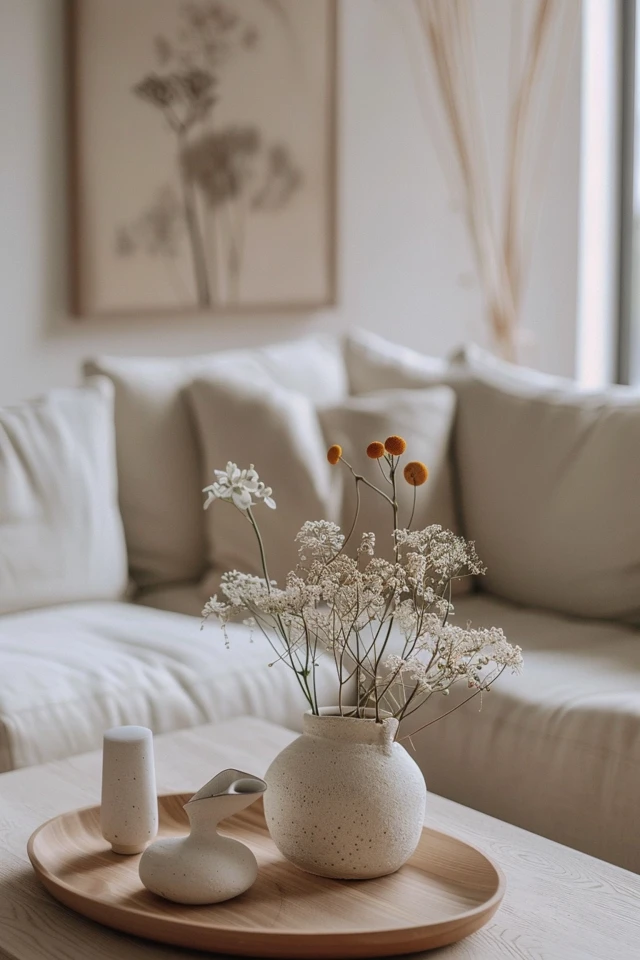
While neutral colors form the base of Scandinavian design, adding muted hues can bring subtle pops of color and interest. Soft blues, greens, blush pinks, and earthy tones can be incorporated through accessories, textiles, and decor items.
Suggested Combinations:
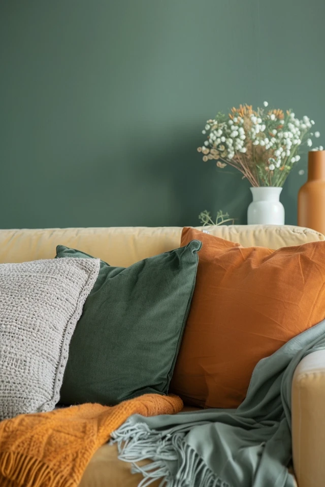
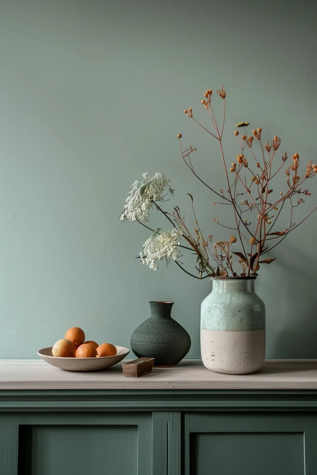
- Walls: Soft blue (e.g., Behr Light French Gray) or muted green (e.g., Benjamin Moore Saybrook Sage)
- Accents: Blush pink cushions, muted green throws, soft blue vases
- Textiles: Patterned rugs and curtains in muted tones
4. Use Contrast and Balance
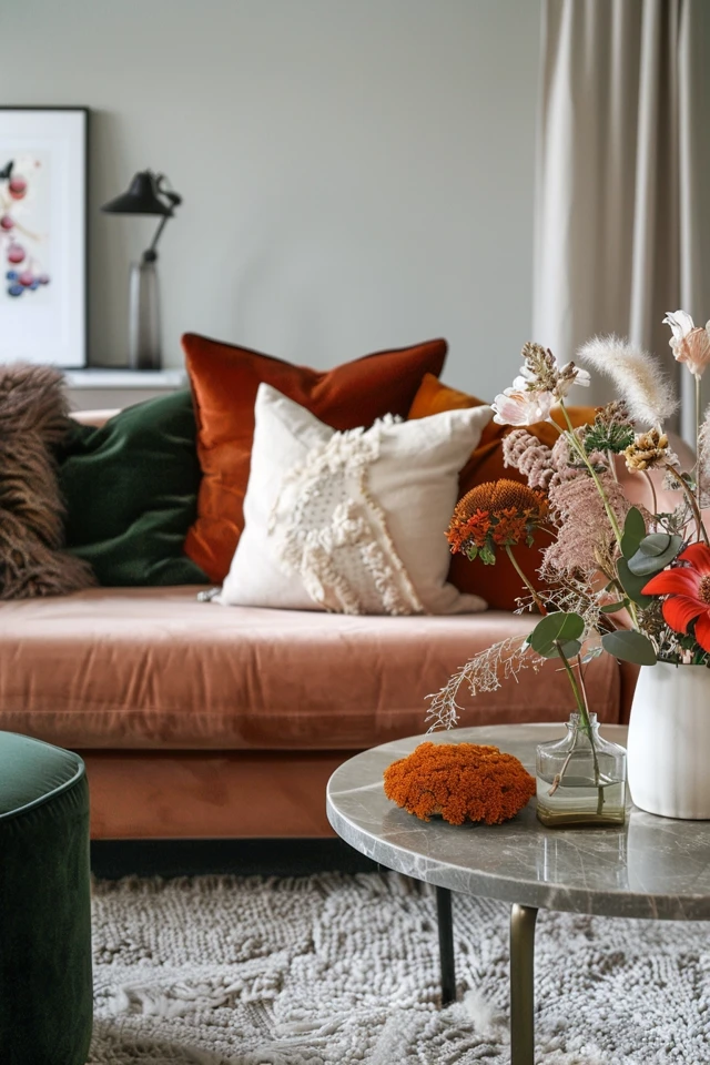
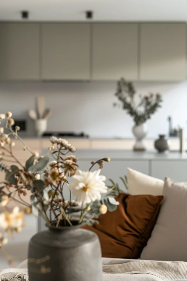
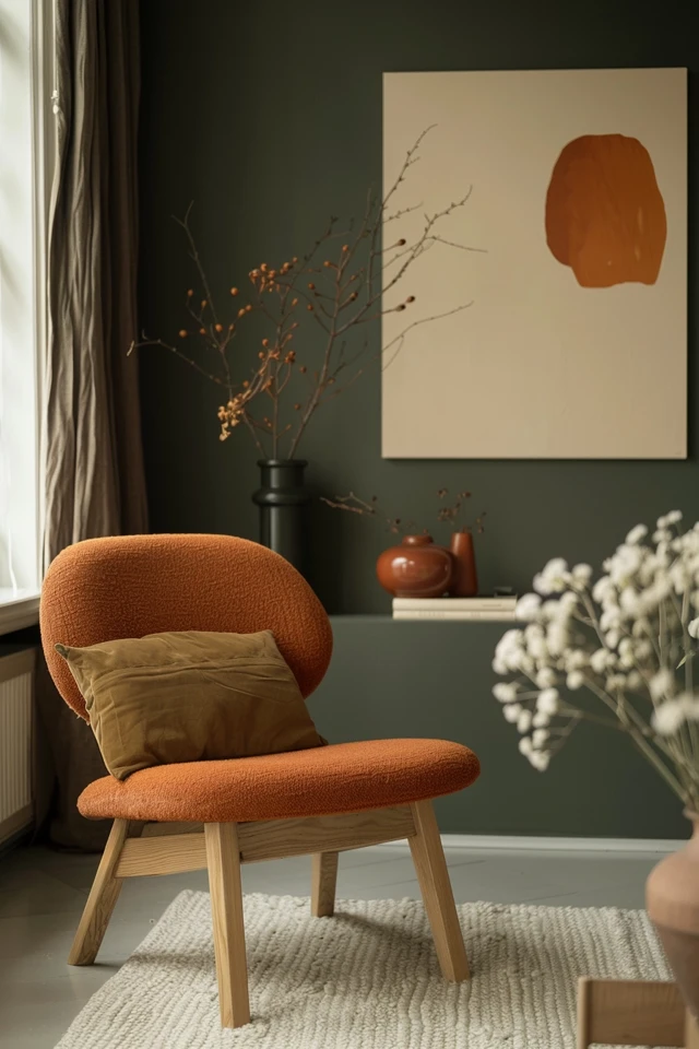
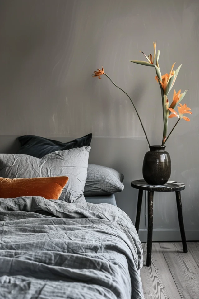
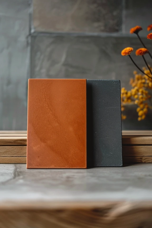
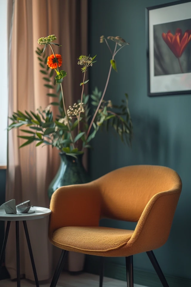
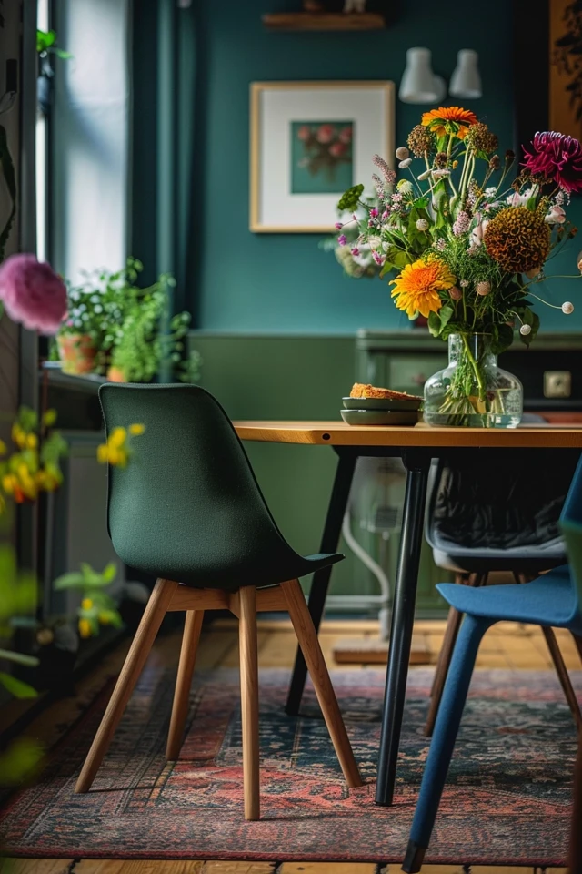
Incorporating darker tones sparingly can create depth and contrast, enhancing the overall design. Charcoal gray, navy blue, and deep green can be used as accent colors to add drama and sophistication without overwhelming the space.
Suggested Combinations:
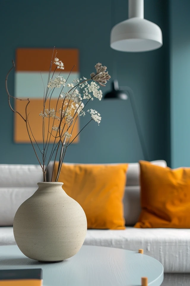
- Accents: Charcoal gray (e.g., Sherwin-Williams Iron Ore) throw pillows, navy blue (e.g., Benjamin Moore Hale Navy) rugs, deep green (e.g., Behr Forest Path) vases
- Furniture: Dark wood or painted accent pieces
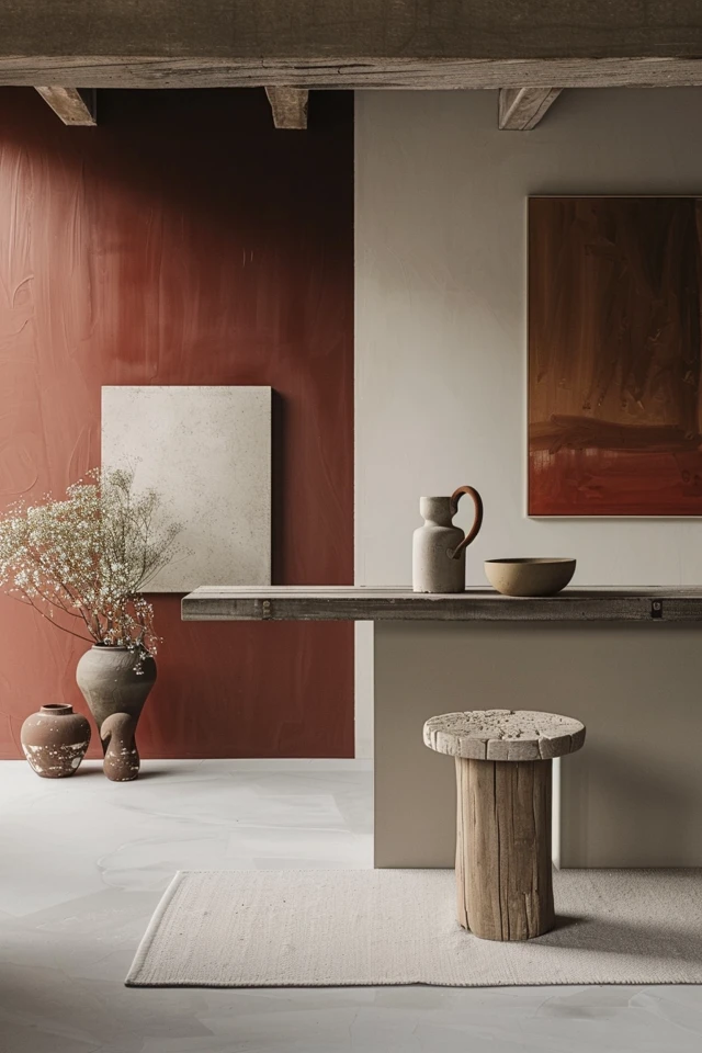
- Walls: An accent wall in a deeper hue to create a focal point
5. Ensure Cohesive Flow
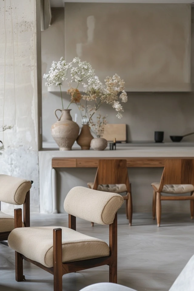
To create a harmonious home, ensure that there is a cohesive flow of colors between rooms. This doesn’t mean every room has to look the same, but the color palette should be consistent enough to create a unified feel. Use similar base colors throughout and introduce variations of accent colors to maintain a sense of continuity.
Suggested Combinations:
- Living Room: White walls, light wood furniture, soft blue accents
- Bedroom: Light gray walls, wooden bed frame, blush pink and white bedding
- Kitchen: White cabinetry, wooden countertops, muted green accessories
- Bathroom: White tiles, wooden vanity, soft blue towels
Conclusion
Choosing the best Scandinavian color palette for your home is all about embracing simplicity, functionality, and natural beauty. By using neutral base colors, incorporating natural accents, adding muted hues, using contrast and balance, and ensuring a cohesive flow, you can create a harmonious and inviting environment that embodies the essence of Nordic minimalism.
As an architect and interior designer with expertise in evidence-based design, I can attest to the transformative power of these color principles. A well-chosen color palette not only enhances the aesthetic appeal of your home but also promotes a sense of well-being and comfort. The simplicity and functionality of Scandinavian design create a calming environment that is perfect for relaxation and daily living.
Whether you are redecorating a single room or your entire home, these tips and ideas will guide you in choosing the best Scandinavian color palette for your space. Embrace the timeless beauty of Nordic minimalism and enjoy the benefits of a beautifully designed home that serves as a sanctuary of tranquility and style.
Inspirational Pictures
