Before Reading this Article, Hire Us As Your Designer or Take a Look at My Top 3 Amazon Picks!
If you are looking to blend Amazon's furniture finds with a personalized touch for your space, check out my portfolio, and hire us! You'll get 3 Idea boards, 2 Concept Boards, 2 Realistic Renderings, a Floor Plan, and a Shopping List! Everything's online, plus a 25% discount on your first online interior design project with my Havenly Promo code 4c7441bcfb. With over 2,000 designs since 2017 and top US brand partnerships, your project is in expert hands. US only. Ready to start?
Color Palette with Golden Touch for Art Lovers Thr...
$26.99 (as of January 22, 2025 12:10 GMT -06:00 - More infoProduct prices and availability are accurate as of the date/time indicated and are subject to change. Any price and availability information displayed on [relevant Amazon Site(s), as applicable] at the time of purchase will apply to the purchase of this product.)2 Pcs Abstract Colorful Line Wall Art Minimalist T...
$13.86 (as of January 22, 2025 12:10 GMT -06:00 - More infoProduct prices and availability are accurate as of the date/time indicated and are subject to change. Any price and availability information displayed on [relevant Amazon Site(s), as applicable] at the time of purchase will apply to the purchase of this product.)HISEVXUS Throw Pillow Covers Set of Two Featuring ...
$12.99 (as of January 22, 2025 12:11 GMT -06:00 - More infoProduct prices and availability are accurate as of the date/time indicated and are subject to change. Any price and availability information displayed on [relevant Amazon Site(s), as applicable] at the time of purchase will apply to the purchase of this product.)Choosing the right color palette for your home decor is essential for creating a harmonious and visually appealing environment. Colors have a profound impact on our emotions, perceptions, and overall well-being. As an architect and interior designer with expertise in evidence-based design, I can guide you through the process of selecting colors that not only look beautiful but also enhance your living space.
A harmonious color palette can transform a room, making it feel cohesive, balanced, and inviting. Whether you’re starting from scratch or updating your current decor, understanding how to use color effectively is key to achieving a unified and aesthetically pleasing home.
In this blog post, we will explore various strategies for creating a harmonious home decor color palette. These tips are designed to inspire and provide practical guidance as you select colors that reflect your personal style and enhance your living environment.
Key Takeaways
- Understand color psychology to choose hues that evoke desired emotions.
- Start with a neutral base to create a cohesive foundation.
- Use a color wheel to find complementary and analogous colors.
- Incorporate varying shades and tones to add depth and interest.
- Test colors in your space before committing to a full palette.
1. Understand Color Psychology
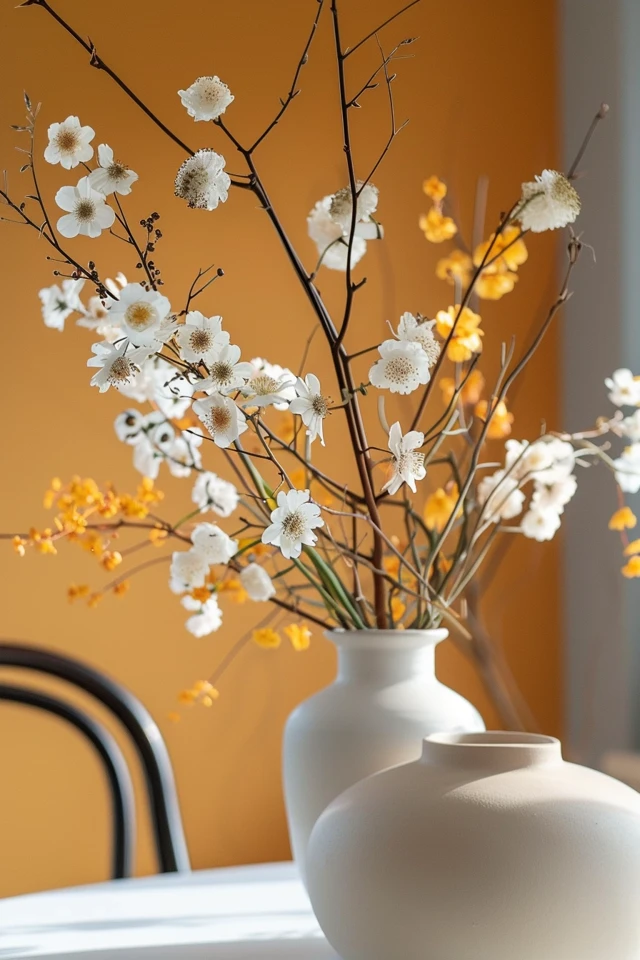
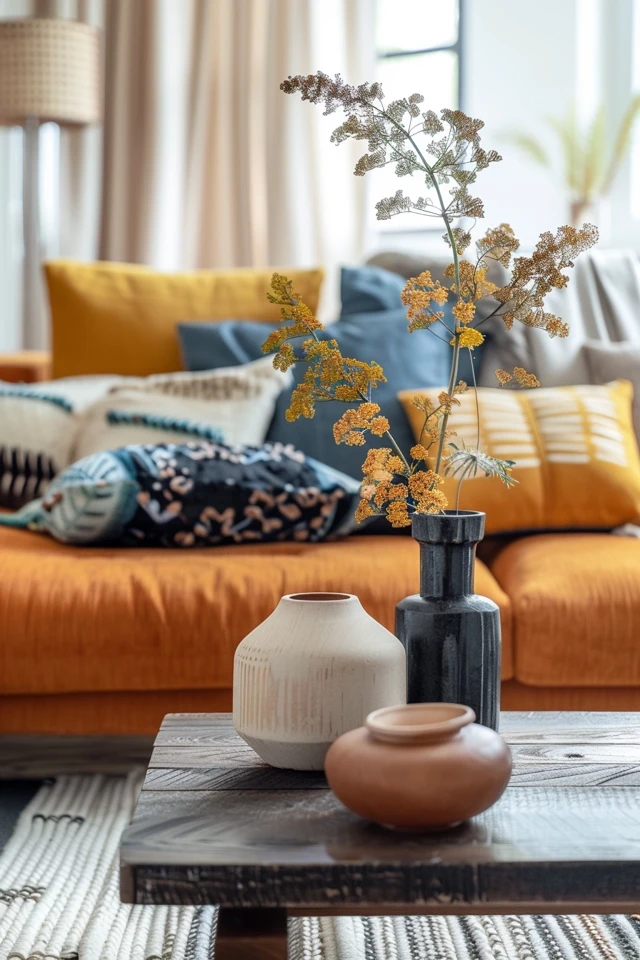
Color psychology is the study of how colors affect our emotions and behavior. By understanding the psychological impact of different hues, you can choose a color palette that aligns with the mood you want to create in each room. For instance, blues and greens are often associated with calmness and relaxation, making them ideal for bedrooms and bathrooms. On the other hand, warm colors like reds, oranges, and yellows can energize and stimulate, perfect for social spaces like the living room or kitchen.
Evidence-based design highlights the importance of color in influencing our well-being and mood. For example, cool colors can reduce stress and promote tranquility, while warm colors can increase energy and stimulate creativity. When choosing your color palette, consider the function of each room and the emotional response you want to elicit.
Neutral colors, such as whites, grays, and beiges, provide a versatile backdrop that can be paired with a variety of accent colors. They create a sense of balance and simplicity, making your home feel more open and airy. Understanding color psychology can help you make informed decisions that enhance the overall atmosphere of your home.
2. Start with a Neutral Base
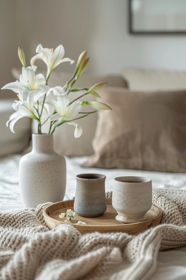
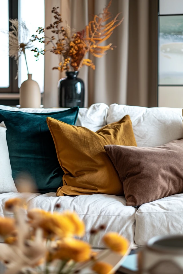
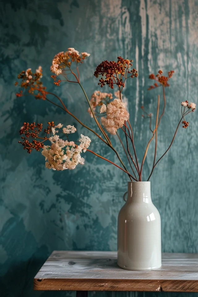
Starting with a neutral base is a great way to create a cohesive foundation for your color palette. Neutral colors like white, beige, gray, and taupe provide a versatile backdrop that can accommodate a variety of design elements. These colors create a calming and balanced environment, allowing other colors, patterns, and textures to stand out.
Evidence-based design supports the use of neutral colors to create a harmonious and flexible space. When your walls, floors, and larger furniture pieces are neutral, it becomes easier to introduce elements from different styles without overwhelming the room. Neutral tones also help to create a sense of continuity and flow throughout your home.
To add visual interest, incorporate different shades and tones of your chosen neutral color. This can create depth and dimension while maintaining a cohesive look. Once you have a neutral base, you can layer in other colors, patterns, and textures to bring your decor vision to life.
3. Use a Color Wheel
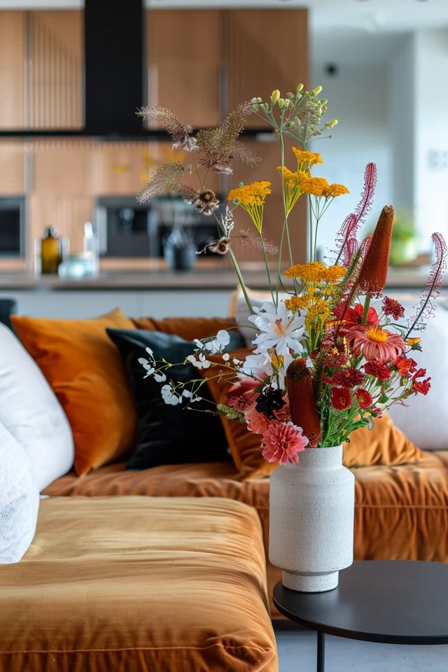
A color wheel is a valuable tool for selecting a harmonious color palette. It shows the relationships between different colors and can help you find complementary and analogous colors that work well together. Complementary colors are opposite each other on the color wheel and create a vibrant contrast when used together. Analogous colors are next to each other on the color wheel and create a more subtle and harmonious look.
Evidence-based design emphasizes the importance of color harmony in creating visually pleasing spaces. When using a color wheel, consider the 60-30-10 rule: 60% of the room should be a dominant color, 30% a secondary color, and 10% an accent color. This distribution ensures that the colors work together seamlessly and that no single color overwhelms the space.
When selecting your color palette, start with a dominant color that sets the tone for the room. Next, choose a secondary color that complements the dominant color and adds depth to the space. Finally, select an accent color that provides a pop of interest and personality. Using a color wheel can help you achieve a balanced and harmonious color scheme.
4. Incorporate Varying Shades and Tones
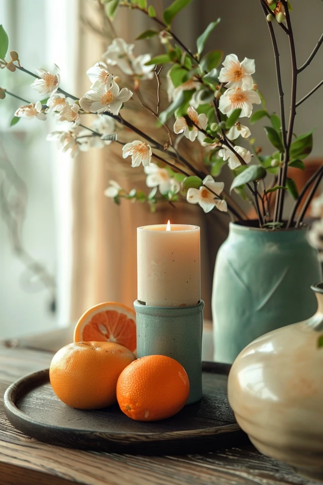
Incorporating varying shades and tones of your chosen colors can add depth and interest to your decor. Different shades of the same color can create a layered and dynamic look, while varying tones can add contrast and dimension. This approach allows you to create a more complex and visually appealing color palette.
Evidence-based design supports the use of varying shades and tones to enhance the sensory experience and create a more engaging environment. For example, a monochromatic color scheme that uses different shades of blue can create a serene and cohesive look. Adding lighter and darker tones can create contrast and highlight different elements of the room.
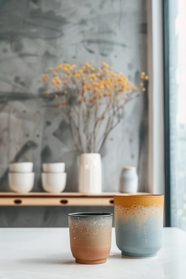
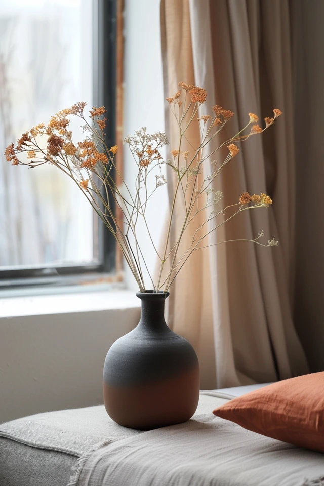
Consider using an ombre effect, where colors gradually transition from light to dark, to add a unique and artistic touch to your decor. This technique can be applied to walls, textiles, and accessories to create a sense of movement and depth. By incorporating varying shades and tones, you can create a more dynamic and visually interesting space.
5. Test Colors in Your Space
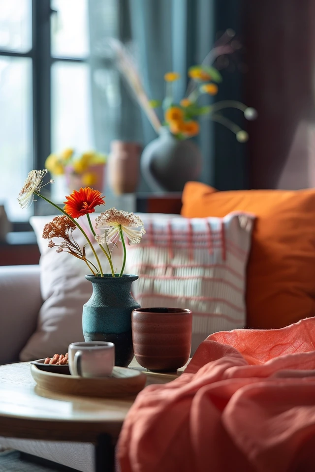
Before committing to a full color palette, it’s important to test your chosen colors in your space. Paint small sections of your walls or use sample boards to see how the colors look in different lighting conditions and at various times of the day. This step is crucial in ensuring that the colors you choose will look as good in your home as they do in your imagination.
Evidence-based design highlights the importance of considering natural and artificial lighting when selecting colors. A color that looks perfect in a well-lit showroom might appear entirely different under the lighting conditions in your home. Testing samples allows you to see how the colors interact with your lighting and other elements in the room.
Don’t rush the testing phase; live with the samples for a few days to get a true sense of how the colors feel in your space. Pay attention to how they look in the morning, afternoon, and evening light. This process will help you make a confident decision and avoid costly mistakes.
Conclusion
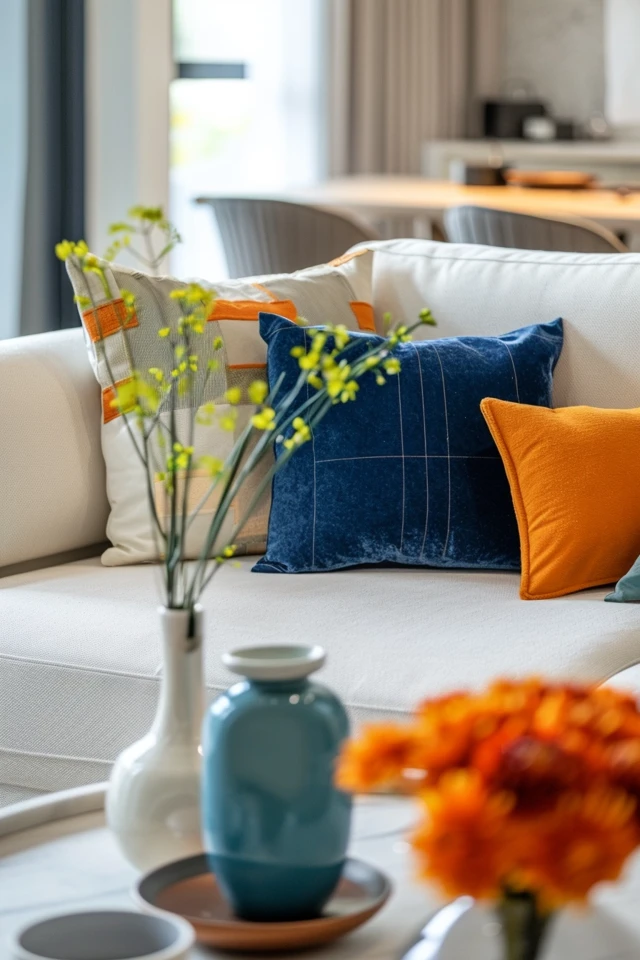
Creating a harmonious home decor color palette is an exciting and rewarding process that can transform your living space into a cohesive and inviting haven. By understanding color psychology, starting with a neutral base, using a color wheel, incorporating varying shades and tones, and testing colors in your space, you can achieve a beautiful and balanced color scheme that reflects your personal style.
As an architect and interior designer with expertise in evidence-based design, I encourage you to embrace these strategies and make informed choices that enhance your living environment. A well-chosen color palette can improve your quality of life, boost your mood, and create a welcoming space for you and your loved ones.
Remember, the key to a successful color scheme is balance and harmony. By following these tips, you can achieve a home decor color palette that is both beautiful and functional. Happy decorating!
Inspirational Pictures

