
Introduction
Color has the power to completely transform a room. It affects the way we feel, perceive space, and interact with our surroundings. Whether you’re creating a tranquil bedroom, an energetic living room, or a balanced home office, understanding color theory can help you design spaces that not only look beautiful but also feel harmonious. The secret to seamless room design lies in the thoughtful use of color to create flow, balance, and a cohesive visual experience.
When I first started experimenting with color in my own home, I learned the hard way how easy it is to create discord. A bold red accent wall clashed horribly with the cool blue furniture in my living room, and the room felt jarring rather than inviting. It wasn’t until I studied color theory—learning about complementary palettes, tonal balance, and the psychology of color—that I was able to bring everything together. By incorporating warm neutral tones to bridge the gap and adding small accents that echoed both the red and blue, I transformed the room into a harmonious space that was vibrant yet balanced.
In this guide, we’ll dive deep into color theory tips that will help you achieve seamless room design. Whether you’re picking a wall color, coordinating decor, or creating transitions between rooms, these strategies will give you the tools to make your home feel unified and visually stunning.
The Perfect Design for You
Color theory is essential for anyone looking to elevate their home’s aesthetic. Whether you’re decorating a studio apartment or a sprawling house, understanding how colors interact and complement each other ensures your space feels cohesive, intentional, and personal.
Imagine a home where the colors flow effortlessly from room to room—a soft neutral palette in the entryway transitions into a serene green in the living room, accented by golden yellows that tie into the sunny tones of the adjacent kitchen. Or picture a bold, dramatic dining room with deep navy walls that perfectly complement the warm orange accents in the connected hallway. These are spaces that don’t just look good—they feel harmonious and put-together.
No matter your style, whether it’s minimalist, maximalist, modern, or eclectic, mastering color theory will help you create a home that reflects your vision and feels seamlessly designed.
Picture Gallery


Why Color Theory Matters in Room Design
Color theory is the foundation of great design. It explains how colors interact, how they influence our mood, and how to use them effectively to create balance and harmony. Here’s why it’s so important:
- Creates Cohesion: Using a thoughtful color palette ensures that every room feels connected, even if each has its own personality.
- Sets the Mood: Colors evoke emotions—blues are calming, yellows are uplifting, and reds are energizing. Choosing the right colors helps you shape how a room feels.
- Defines Space: Color can visually expand or contract a space, making it feel larger, cozier, or more open.
- Directs the Eye: Strategic use of color highlights focal points, architectural features, or decor elements.
- Personalizes Your Home: A well-curated color scheme reflects your taste and personality, making your home feel uniquely yours.
Designers often emphasize that color is as much about balance and proportion as it is about aesthetics. By applying the principles of color theory, you can create spaces that are visually engaging and effortlessly harmonious.
How to Use Color Theory for Seamless Room Design: Step-by-Step
1. Understand the Color Wheel
- The color wheel is the foundation of color theory, showing the relationships between colors. Here’s how to use it:
- Primary Colors: Red, yellow, and blue—these form the base of the wheel.
- Secondary Colors: Green, orange, and purple—created by mixing primary colors.
- Tertiary Colors: Combinations of primary and secondary colors, such as teal or magenta.
- Learn how colors interact:
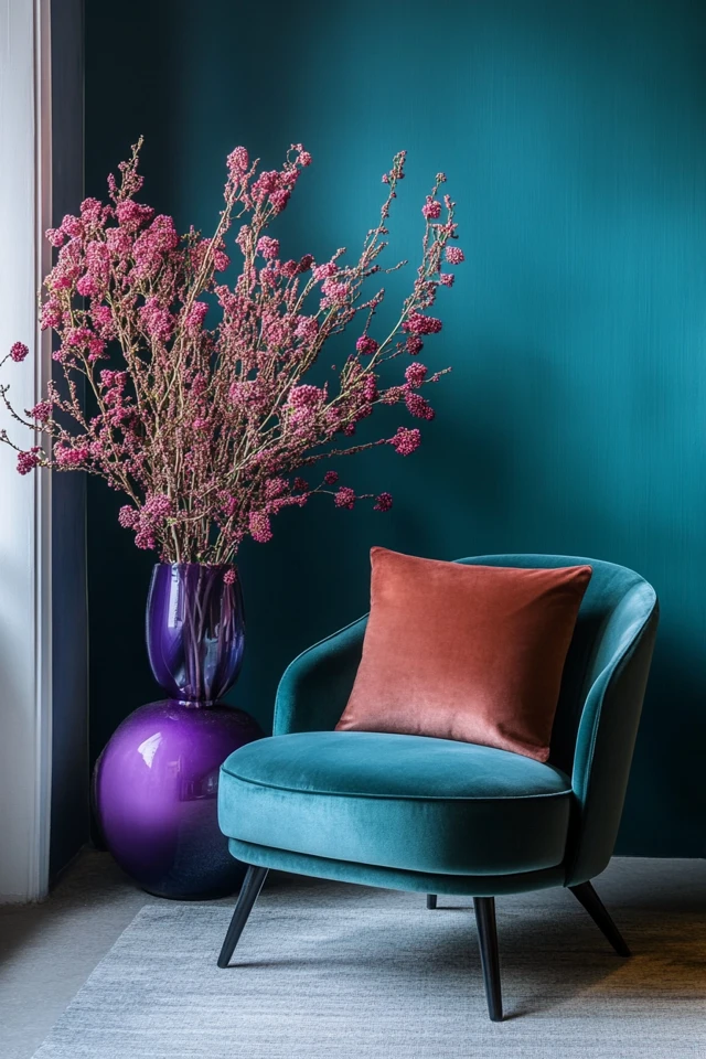
- Complementary Colors: Opposites on the wheel (e.g., blue and orange) create bold, dynamic contrasts.
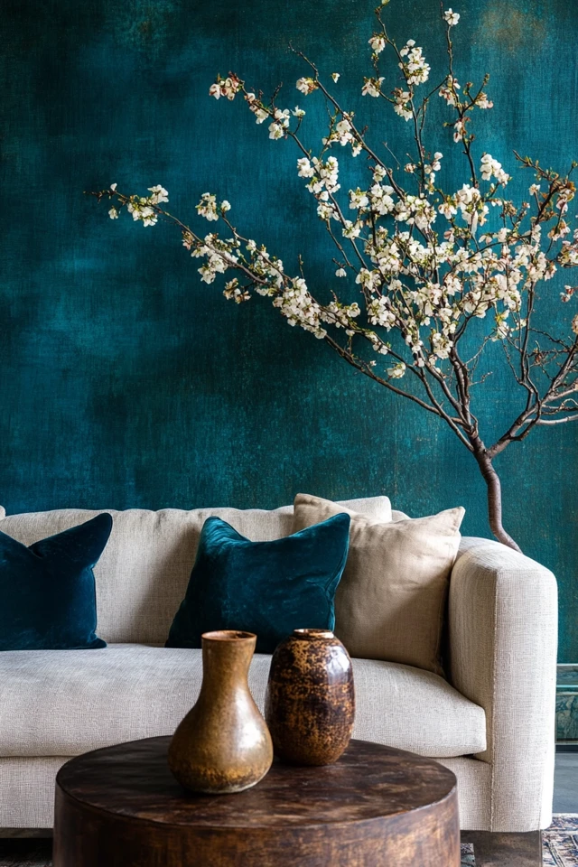
- Analogous Colors: Neighboring colors (e.g., blue, teal, green) create harmony and flow.
- Triadic Colors: Three evenly spaced colors (e.g., red, yellow, blue) create balanced yet vibrant palettes.
- Example: A triadic palette in a kitchen might pair soft yellow walls with teal barstools and red accents for a lively, playful feel.
2. Pick a Dominant Color
- Choose one primary color to anchor your space and build the rest of the palette around it:
- Use the dominant color on larger surfaces like walls, rugs, or sofas.
- Ensure the color sets the mood you want (e.g., calming blue for bedrooms or energizing orange for creative spaces).
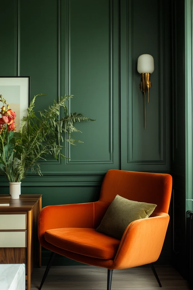
- Example: In a living room, soft sage green walls can set a tranquil tone, complemented by neutral furnishings and pops of burnt orange.
3. Incorporate Accent Colors
- Accent colors add depth and interest to your design:
- Use them in smaller doses through decor like pillows, artwork, or vases.
- Choose complementary or contrasting colors to make accents stand out.
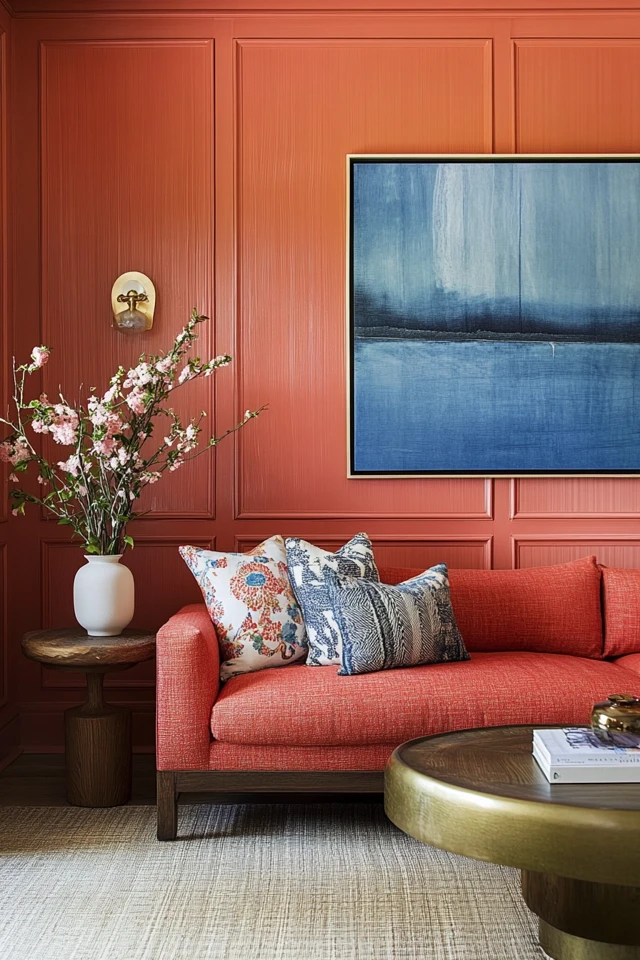
- Example: A neutral gray bedroom comes alive with mustard yellow throw pillows and navy blue curtains.
4. Stick to the 60-30-10 Rule
- This timeless design principle ensures balance in your color scheme:
- 60% Dominant Color: Covers most of the room (e.g., walls or large furniture).
- 30% Secondary Color: Adds contrast and supports the dominant color (e.g., curtains or rugs).
- 10% Accent Color: Adds pops of interest and personality (e.g., decor or artwork).
- Example: A dining room with navy walls (60%), white chairs (30%), and gold accents (10%) feels cohesive and dynamic.
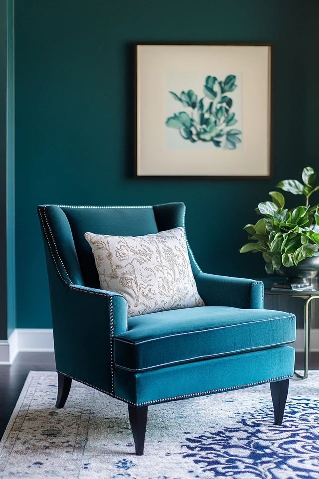
5. Use Neutrals to Balance Bold Colors
- Neutrals like white, gray, beige, or taupe provide a calming backdrop for bold colors:
- Use neutrals to tone down vibrant palettes or create negative space.
- Mix warm neutrals (like cream) with warm tones and cool neutrals (like gray) with cool tones.
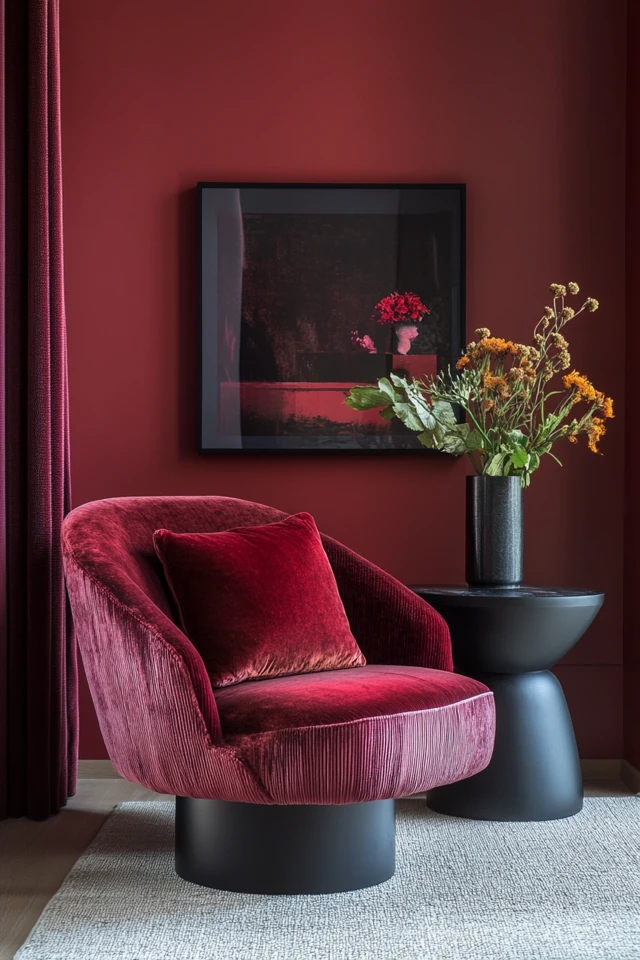
- Example: A bold red accent wall in a study feels grounded when paired with soft beige furniture and a white ceiling.
6. Pay Attention to Undertones
- Colors have undertones that influence how they appear:
- Warm Undertones: Yellows, oranges, or reds create a cozy, inviting feel.
- Cool Undertones: Blues, greens, or purples evoke calmness and serenity.
- Neutral tones can lean warm or cool—test paint swatches in different lighting to find the right fit.
- Example: A gray with blue undertones creates a modern, cool aesthetic, while a gray with beige undertones feels warmer and cozier.
7. Create Flow Between Rooms
- Use a cohesive color palette throughout your home to connect different spaces:
- Repeat colors in varying intensities to create a sense of continuity.
- Use transitional colors, like a soft beige hallway connecting a blue living room and a green kitchen.
- Example: A home with shades of teal in the living room, navy in the bedroom, and soft green in the bathroom feels unified without being monotonous.
8. Use Color to Manipulate Space
- Light colors open up a space, while dark colors create coziness and intimacy:
- Use light hues in small or narrow rooms to make them feel larger.
- Use deep, rich tones in larger spaces for warmth and drama.
- Example: A tiny powder room painted in a soft blush pink feels airy, while a spacious dining room painted in deep charcoal creates a sophisticated atmosphere.
9. Consider Lighting
- Lighting affects how colors appear:
- Natural light enhances true colors, while artificial light can add warmth or coolness.
- Test colors at different times of day to see how they interact with your lighting.
- Example: A warm beige that looks perfect in natural daylight might feel too yellow under warm artificial lighting—choose tones accordingly.
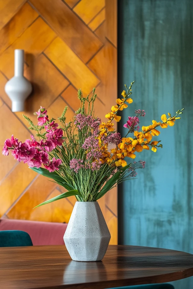
10. Experiment with Patterns and Textures
- Patterns and textures add depth and interest without overwhelming the color scheme:
- Use patterned textiles, wallpaper, or rugs to introduce subtle variations of your chosen colors.
- Mix textures like smooth velvet, rough linen, or glossy ceramics for a layered effect.
- Example: A neutral living room with a patterned area rug in soft grays and blues feels dynamic yet cohesive.
FAQ
1. How do I choose the right colors for my room?
Start by identifying the mood you want to create and the room’s purpose. Use the color wheel to build a harmonious palette based on complementary, analogous, or triadic schemes.
2. Can I use bold colors without overwhelming the room?
Yes! Balance bold colors with neutrals or use them sparingly as accents to create a striking yet harmonious design.
3. How do I coordinate colors between rooms?
Create a cohesive palette with 3-5 main colors and use variations of these shades throughout your home for flow and continuity.
4. What’s the easiest way to experiment with color?
Start small—use throw pillows, artwork, or decor in your chosen colors to see how they feel before committing to larger elements like walls or furniture.
5. How can I make small rooms feel larger with color?
Stick to light, cool tones like pale blues, greens, or whites, and use a monochromatic palette to reduce visual clutter and create a sense of openness.
Variations
- Modern Minimalism: Stick to a monochromatic or analogous palette in soft neutrals for a clean, calming look.
- Eclectic Vibes: Mix and match bold complementary colors for a playful, dynamic aesthetic.
- Coastal Retreat: Use a soft palette of blues, whites, and sandy beiges to evoke a breezy, beach-inspired feel.
- Rustic Warmth: Incorporate earthy tones like terracotta, olive, and mustard for a cozy, grounded atmosphere.
- Urban Chic: Pair deep, moody tones like charcoal and emerald with metallic accents for a sophisticated, dramatic effect.
How to Showcase It
- Living Rooms: Use a bold accent wall and coordinating furniture for a balanced yet eye-catching design.
- Bedrooms: Incorporate soft, soothing colors with layers of texture for a serene retreat.
- Kitchens: Combine neutral cabinets with colorful backsplashes or accessories for a fresh, modern look.
- Bathrooms: Add pops of color through towels, shower curtains, or artwork against a neutral backdrop.
- Home Offices: Use energizing colors like greens or yellows to promote focus and creativity.
Occasions to Feature It
- Seasonal Updates: Swap out decor or accents to reflect seasonal color trends.
- Home Refreshes: Redesign a room with new colors to rejuvenate your space.
- Entertaining Guests: Use color to create a welcoming, vibrant atmosphere.
- Family Spaces: Choose durable, mood-enhancing colors for high-traffic areas like living rooms or playrooms.
- Special Events: Add temporary color through linens or decor to celebrate holidays or milestones.
Conclusion
Color is one of the most powerful tools in room design, capable of shaping how a space feels and functions. By mastering color theory, you can create rooms that flow seamlessly, reflect your personal style, and evoke the perfect mood for every occasion.
From understanding the color wheel to balancing bold accents with soothing neutrals, these tips will help you make confident, intentional choices that transform your home into a cohesive, visually stunning haven. So grab a swatch book, experiment with palettes, and let color guide your design journey. With these strategies, your home will look and feel as harmonious as you’ve always dreamed!

About the Author
M.Arch. Julio Arco is an architect, interior designer, and urban planner with degrees from ITESM, McGill University, and a certificate in Architecture in Urban Context from LDM. Julio has designed interiors for over 1,200 clients and also teaches architecture at ITESM.
His go-to sites for inspiration include Houzz, Apartment Therapy, HGTV, Architectural Digest, and The Spruce.