Introduction
Creating a balanced color palette for your home is like crafting the perfect playlist—it sets the mood, brings harmony, and reflects your unique style. But let’s be honest: it can feel a bit overwhelming. I still remember the first time I tried to choose colors for my living room. Armed with dozens of paint swatches and a Pinterest board full of inspiration, I quickly realized I had no idea how to make it all work together. It wasn’t until I learned to trust the process and follow a few basic principles that everything fell into place.
Now, my space feels cohesive and calm, with just the right pops of color to keep things interesting. Whether you’re starting from scratch or looking to refine an existing space, this guide will show you how to create a perfectly balanced color palette that works for any room.
Why Is a Balanced Color Palette Important?
Key Benefits
- Creates Harmony: A cohesive palette ties your room together, making it feel intentional.
- Sets the Mood: Colors influence how we feel—soothing blues for relaxation, energizing yellows for vibrance.
- Reflects Personality: Your choice of colors speaks to your personal style and preferences.
- Increases Visual Flow: A balanced palette ensures your home feels connected from room to room.
Step 1: Start With Inspiration
Why It Works
Drawing inspiration from images, nature, or your favorite objects helps you establish a foundation for your color palette.
How to Do It
- Browse Pinterest, Instagram, or design magazines to identify color schemes you love.
- Take note of colors in nature—beach tones, forest greens, or desert neutrals.
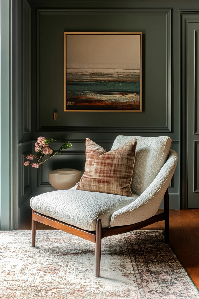
- Use a piece of art, a rug, or a favorite accessory as your starting point.
- Save your inspirations to a mood board to visualize how the colors work together.
Step 2: Choose a Base Color
Why It Works
A base color is the backbone of your palette and sets the tone for the entire room.
How to Do It
- Select a neutral or subtle shade like white, beige, gray, or soft pastels.
- Use the base color for large surfaces like walls, ceilings, and floors.
- Stick to a shade that complements your lighting—cool tones for bright spaces, warm tones for darker rooms.
- Keep the base color versatile so it can work with accent and secondary colors.
Step 3: Add Two or Three Complementary Colors
Why It Works
Complementary colors bring depth and interest to your palette without overwhelming the space.
How to Do It
- Choose colors that pair well with your base—think soft greens, muted blues, or earthy tones.
- Use these shades for furniture, rugs, or curtains.
- Stick to a 60-30-10 rule: 60% base, 30% complementary, and 10% accent colors.
- Keep the complementary colors muted or slightly desaturated for a cohesive look.
Step 4: Pick an Accent Color
Why It Works
Accent colors add personality and energy, drawing attention to specific areas or objects.
How to Do It
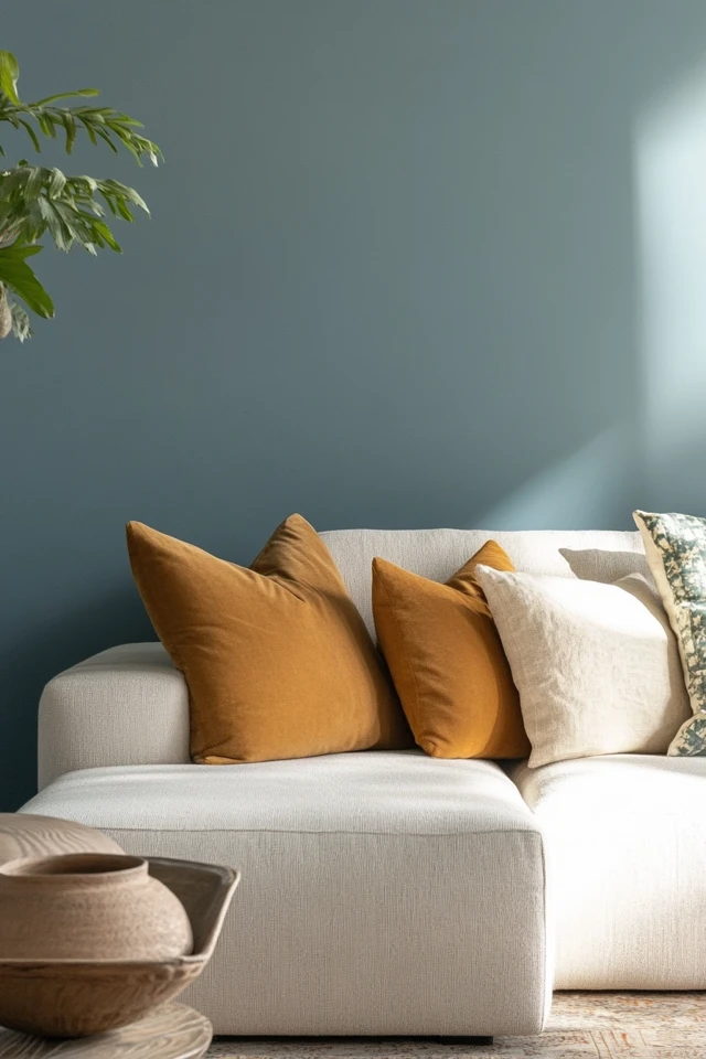
- Choose a bolder or brighter color, like mustard yellow, navy blue, or terracotta.
- Use accents sparingly on throw pillows, artwork, or small decor pieces.
- Make sure the accent color contrasts enough to stand out but still complements the overall palette.
- Test the accent color in multiple places to see where it feels most impactful.
Step 5: Use Color Psychology
Why It Works
Colors have emotional and psychological effects, so understanding their impact can help you create the right mood.
How to Do It
- Use blues and greens for calming spaces like bedrooms and bathrooms.
- Incorporate yellows and oranges for energy in kitchens or playrooms.
- Opt for earthy tones like browns and olives for grounding, cozy vibes in living areas.
- Stick to light neutrals in small spaces to make them feel larger and more open.
Step 6: Stick to a Limited Palette
Why It Works
A limited palette ensures your space feels cohesive and avoids visual clutter.
How to Do It
- Limit your palette to 3–5 colors, including neutrals and accents.
- Repeat colors throughout the room in different textures or finishes to create consistency.
- Use varying shades of the same color to add depth without introducing new hues.
- Keep bold or bright colors to a minimum for a balanced, polished look.
Step 7: Balance Warm and Cool Tones
Why It Works
Balancing warm and cool tones creates harmony and prevents the room from feeling too stark or one-dimensional.
How to Do It
- Pair warm neutrals like beige or taupe with cool blues or grays.
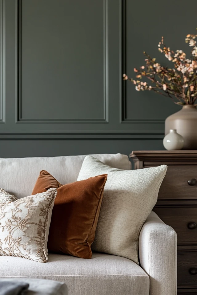
- Use warm tones like terracotta or mustard as accents in cooler spaces.
- Incorporate wood, leather, or brass for warmth, and marble, glass, or metal for coolness.
- Evaluate the overall feel of the space to ensure one tone doesn’t overpower the other.
Step 8: Use Texture and Pattern for Depth
Why It Works
Textures and patterns allow you to introduce color subtly, adding dimension without overwhelming the palette.
How to Do It
- Use patterned throw pillows, rugs, or curtains in your complementary or accent colors.
- Add texture with natural materials like wood, linen, or rattan in your chosen hues.
- Layer glossy and matte finishes to create visual contrast within the same color.
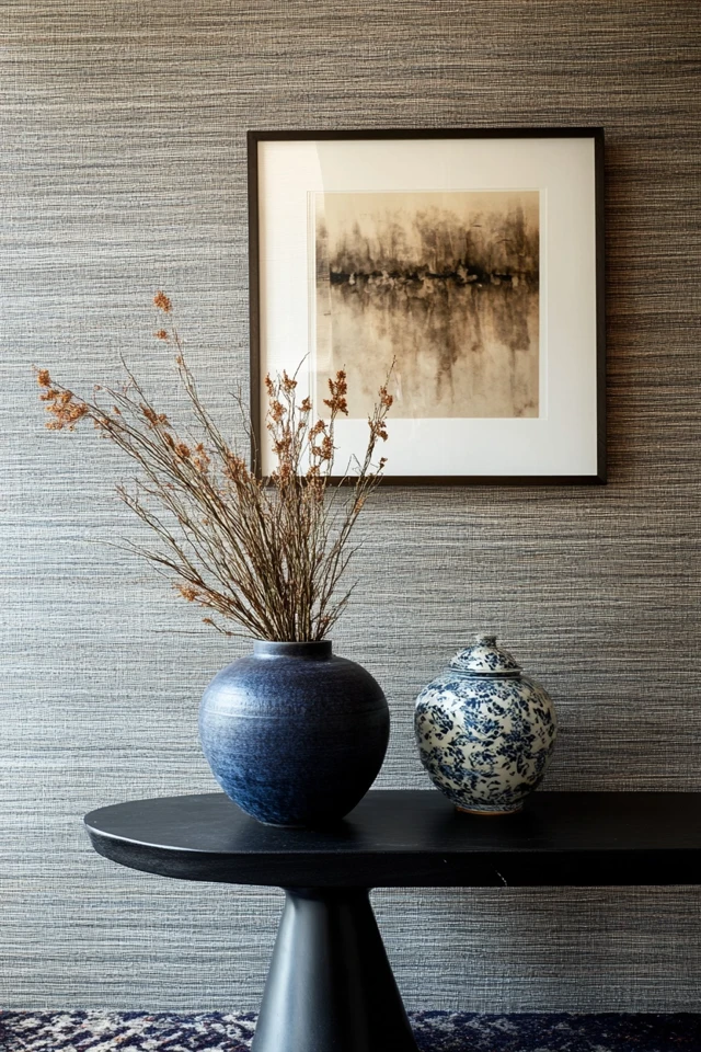
- Incorporate patterned wallpaper or upholstery for an elegant statement.
Step 9: Test Your Colors in the Space
Why It Works
Colors can look different depending on lighting, so testing ensures they work in your specific room.
How to Do It
- Paint swatches of your chosen colors on the wall and observe them at different times of day.
- Test fabrics, rugs, or accessories under your room’s lighting conditions.
- Place color samples near existing furniture to ensure harmony.
- Adjust shades as needed to complement natural and artificial lighting.
Step 10: Create Flow Between Rooms
Why It Works
A cohesive color scheme throughout your home creates a sense of continuity and balance.
How to Do It
- Use the same base color in multiple rooms to tie them together.
- Repeat complementary and accent colors in subtle ways, like through decor or textiles.
- Allow each room to have its unique personality while maintaining a shared palette.
- Transition between rooms with gradient shades of the same color family.
Picture Gallery

Conclusion
Crafting a perfectly balanced color palette is an art, but it doesn’t have to be intimidating. By following these 10 steps, you can create a harmonious space that feels cohesive, welcoming, and uniquely yours.
What I love most about color palettes is their ability to evoke emotion and set the tone for your home. Whether you’re drawn to calming neutrals, playful pastels, or earthy tones, the key is to experiment and trust your instincts.
So grab those swatches, test a few ideas, and watch your space come to life with the perfect balance of colors. Your dream home is just a palette away!
FAQ
How do I choose a color palette if I have no design experience?
Start with inspiration from nature or art and stick to simple rules like the 60-30-10 ratio. Neutral tones are a great foundation for beginners.
What is the 60-30-10 rule?
This rule suggests using 60% of your main color, 30% of a secondary color, and 10% of an accent color to create balance.
Can I mix warm and cool colors in one room?
Yes! Mixing warm and cool tones adds depth and balance. Pair complementary shades, such as warm terracotta with cool gray.
Should every room have the same color palette?
Not necessarily, but maintaining some consistency through shared base or accent colors creates flow between rooms.
Where can I find inspiration for color palettes?
Look to Pinterest, Instagram, nature, art, and even your favorite fashion pieces for color inspiration.

